
Designing for versatility...
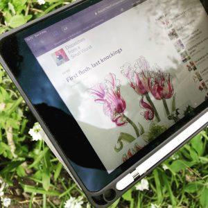
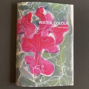
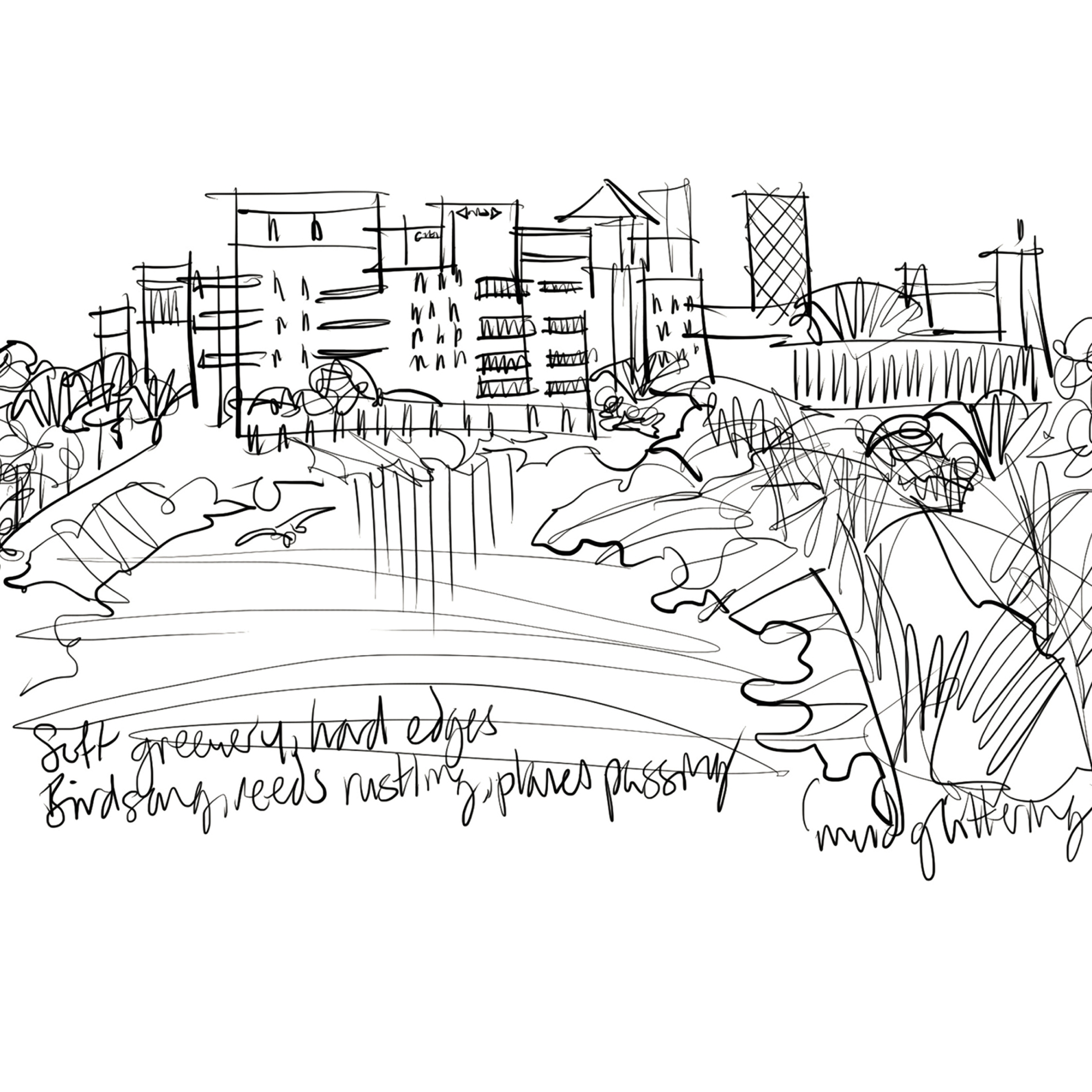
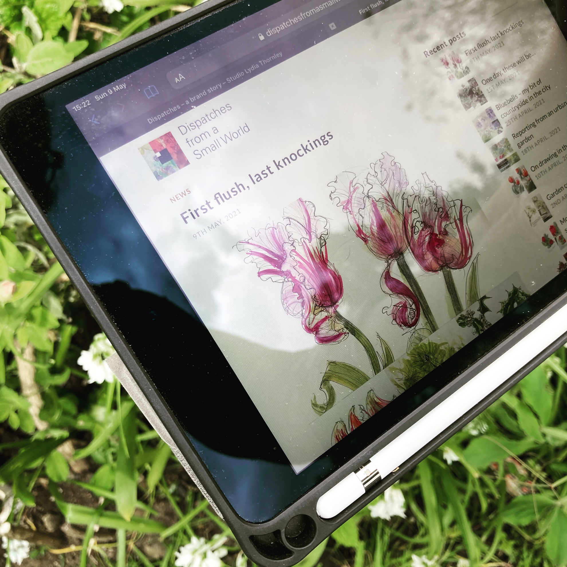
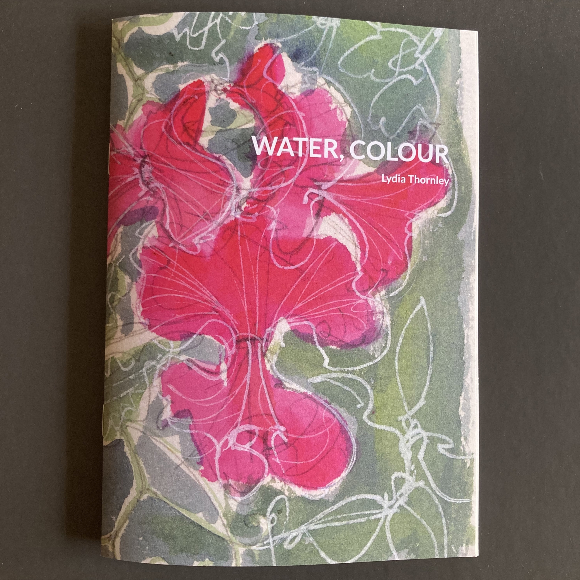
My lockdown project Dispatches from a Small World reports from my urban garden in sketches. It’s quite the flowering of work: now 200 drawings, using up waste paper from samples and dummies, it’s sprouted a blog.
But underneath this huge project, there’s another story, of a brand designed for change…
In 2019, with my creative practice expanding, I used a studio move as an opportunity to rethink my brand.
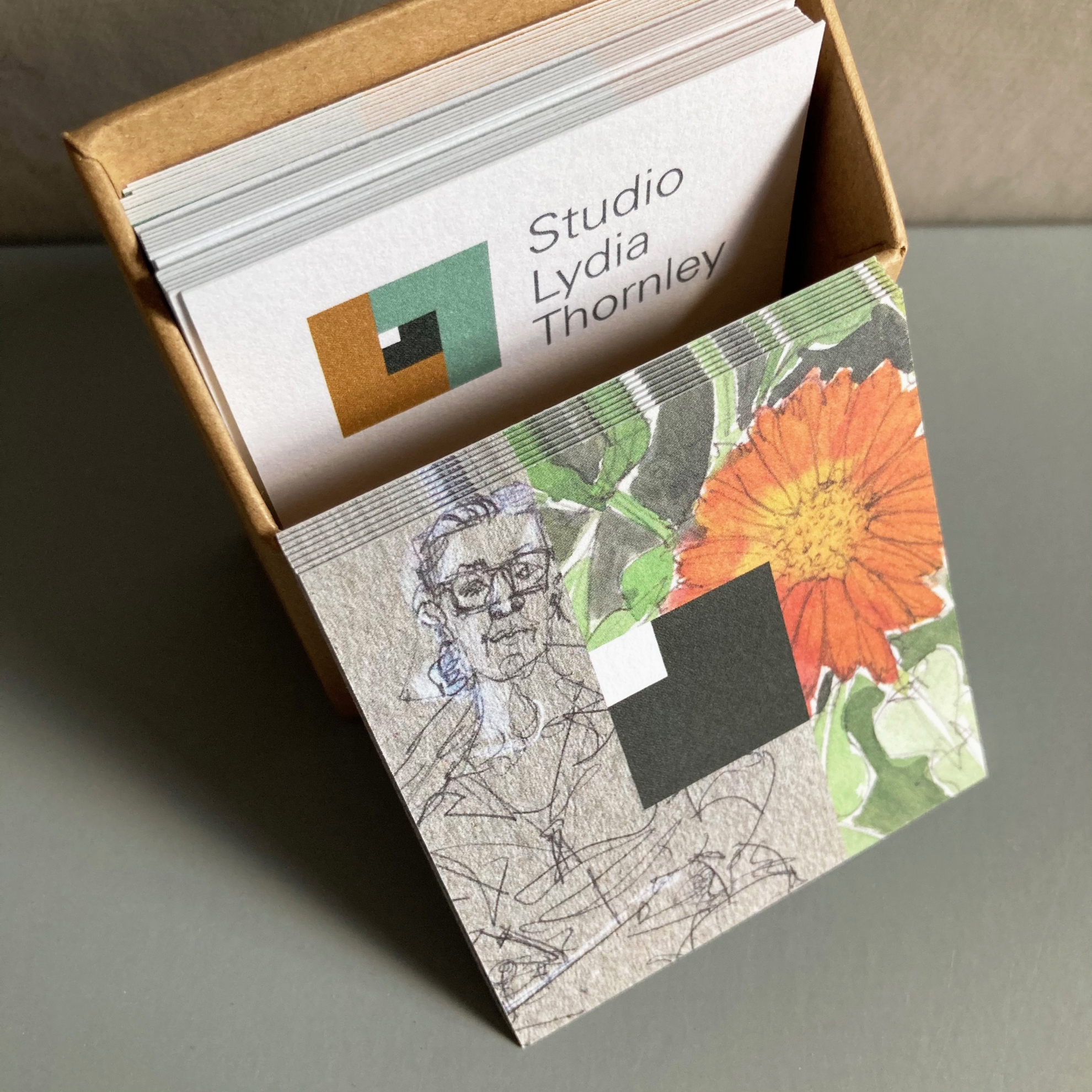
Lydia Thornley Design gave my recently-fledged illustration work nowhere to go so I started with a change of name to Studio Lydia Thornley.
I built the visual identity on the thing driving all of my work: a curious mind. In a spirit of nerdery I updated the logo to a square eye. In its simplest form, the eye is colour-matched to the green and tan in my eye colour. It’s also designed to be filled with images. Subtle changes in fonts made the identity more functional online and more accommodating for a broad spectrum of visual content.
My web interface was designed for versatility too, for people wanting an overview or to focus on a particular area of work. The apparently simple interface is the result of much discussion with web developer John Mounsey. But what users need can change. During the pandemic, noticing that everyone’s attention was scattered, I switched from a newsy home page to a much simpler summary.
So when I launched Dispatches from a Small World, we could simply take and adapt two pages from the Studio Lydia Thornley website, to make a standalone blog which, to contacts who already know me, could feel like a microsite.
Companies and organisations evolve so I think ahead when designing identities. And I’m grateful for having turned that thinking on my own communications just before we were thrown into times of change and challenge that were unimaginable in 2019. Designing-in versatility, when opportunities have popped up that have been just as unexpected, I’ve been ready.
.


