An identity about identity...
Newham is an East London borough with a hugely-varied and youthful demographic and high levels of deprivation. Outside some local cultural and community projects, little is known about its LGBT+ residents and communities.
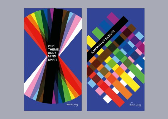
So its LGBT+ History Month visual identity has a job of including and welcoming to do – and of building awareness over time.
Newham also has a cultural programme, Newham Unlocked, in which its History Month events sit, and its LGBT+ History month programme is part of a national event. It has an in-house design team and a web developer.
So the identity needs to work in context and for its internal users as well as its external audiences.
In the pandemic, everything has to work online. And in sensitivity to the multiple challenges of these times, we created a project together that was compact, responsive, economical and human, providing assets and templates for internal implementation.
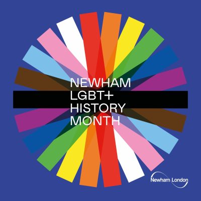
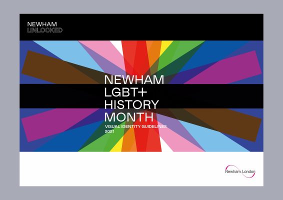
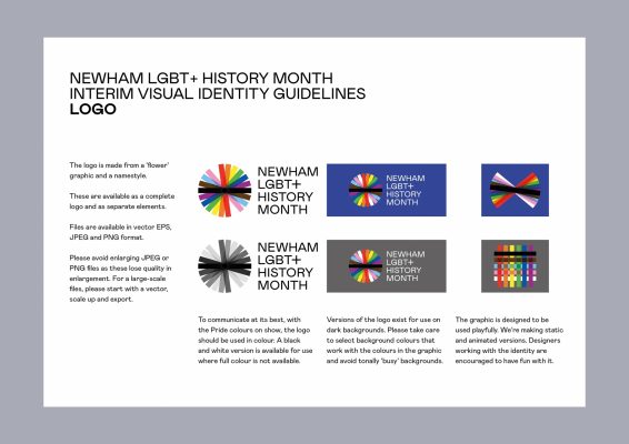
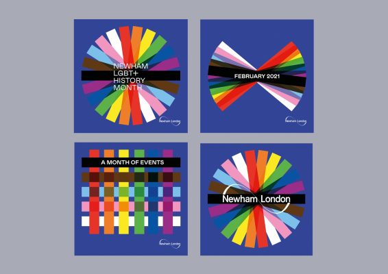
Starting with the Progress Pride flag, I reassembled the stripes into a dynamic graphic that can form a variety of shapes and patterns, with all sorts of scope for lively animation of the identity as static and moving images. The typography creates the link with Newham Unlocked and the background colour references the national event. The identity is designed to be versatile and playful in application. And that matters, not just in communications but for the other creative and tech people who will work with the identity over time. I wanted people to be able to bring their ideas and knowledge – and in doing that, to add value.
So the design toolkit doesn’t just set out design principles; it invites creative users to have fun with it.
And I did just that in bringing in studio-mate and fellow Newham resident Narcis Sauleda to animate the identity for its moving-image social media posts and stories. He came up with ideas I hadn’t asked for. I love it when that happens.
See the full programme here.
Website by Pixel Parlour.


