

A place full of stories...
Tucked-away in Tottenham is a 16th century former manor house, with a Tudor tower to the side. It’s full of stories – human, industrial, local and global, on show in what is now the museum and in its archive. And it’s there for its community, from children’s workshops to dementia-friendly activities.
Until now, visitors and researchers have found information through the Haringey Council website and local printed communications. But new funding has enabled it to have its own web presence, to tell more stories, do more online and increase its reach to more people who would be interested to visit, learn and enjoy what the museum and its archives have to offer.
Part of that project is a visual identity. Which is where I come in.
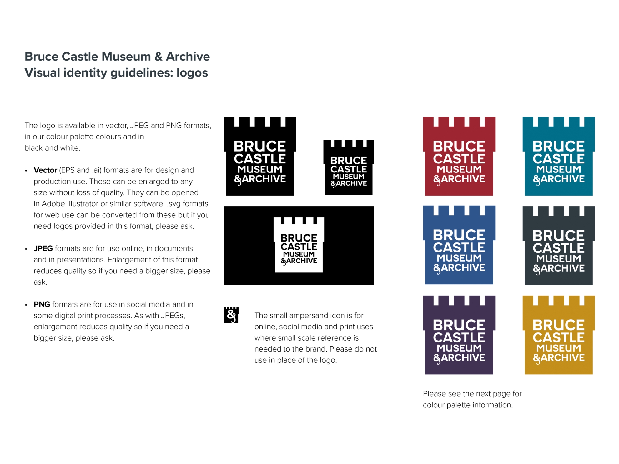
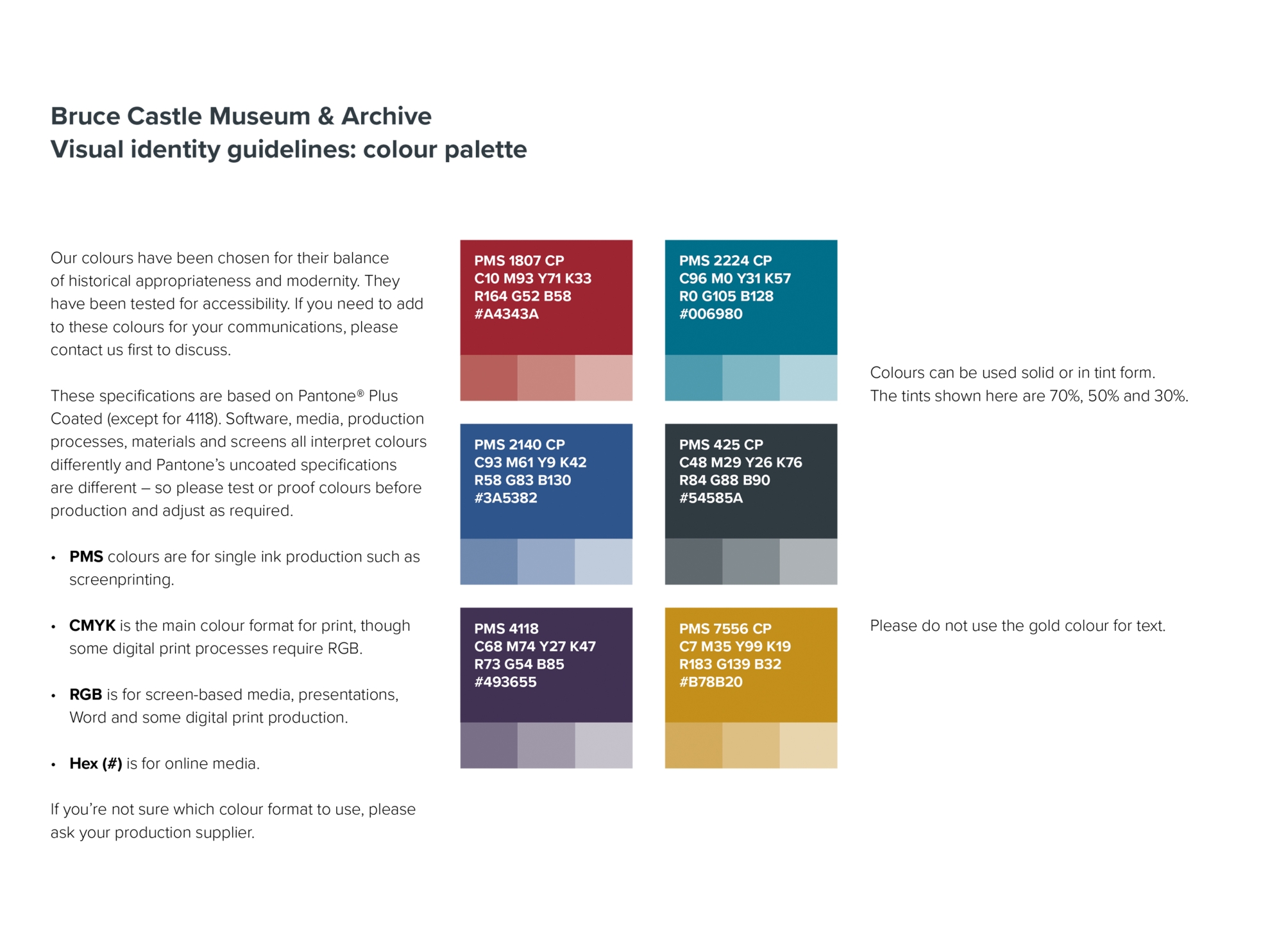
Bruce Castle has a huge amount of knowledge, enthusiasm, energy and history. So the identity comes from the place and its people. The typographic quirks of the gate sign have found their way into the namestyle. The tower has been brought into service as an easily recognisable graphic. The ampersand contains flourishes from an in-period typeface, echoing the interior’s fireplaces. The accessibility at the heart of the museum’s activities has translated into text and headline fonts chosen for readability. And the colour palette has been chosen by the museum’s curator and staff, who know a lot more about historic colour than I do.
It’s been a collaboration – and an opportunity to find out about this fascinating place. The visual identity has been worked gently into early communications and the website, commissioned separately by the museum, has launched.
Since delivering the master identity elements and guidelines, I’ve visited the archives as a researcher, come along to see the latest exhibition and done an online talk on ampersands for its events programme.
More on Bruce Castle Museum and Archive here.


