

It all started with listening...
I’ve worked with Bowen Craggs, experts in corporate digital communications, from startup. Our long-term client relationship has given me the chance to adapt the brand identity as the company has grown, while understanding the values at its heart.
Now the company is 20. It’s a good age. And it’s part of the age group in its insight-packed report How the next generation is reshaping corporate digital communication. The report is available to Bowen Craggs Club members.
Looking at the design of the report has been an opportunity to see how far we can push the identity to make the design relevant – while at the same time, being authentically Bowen Craggs, a brand underpinned by rigorous thinking, excellent writing and a collegiate approach to working with clients.
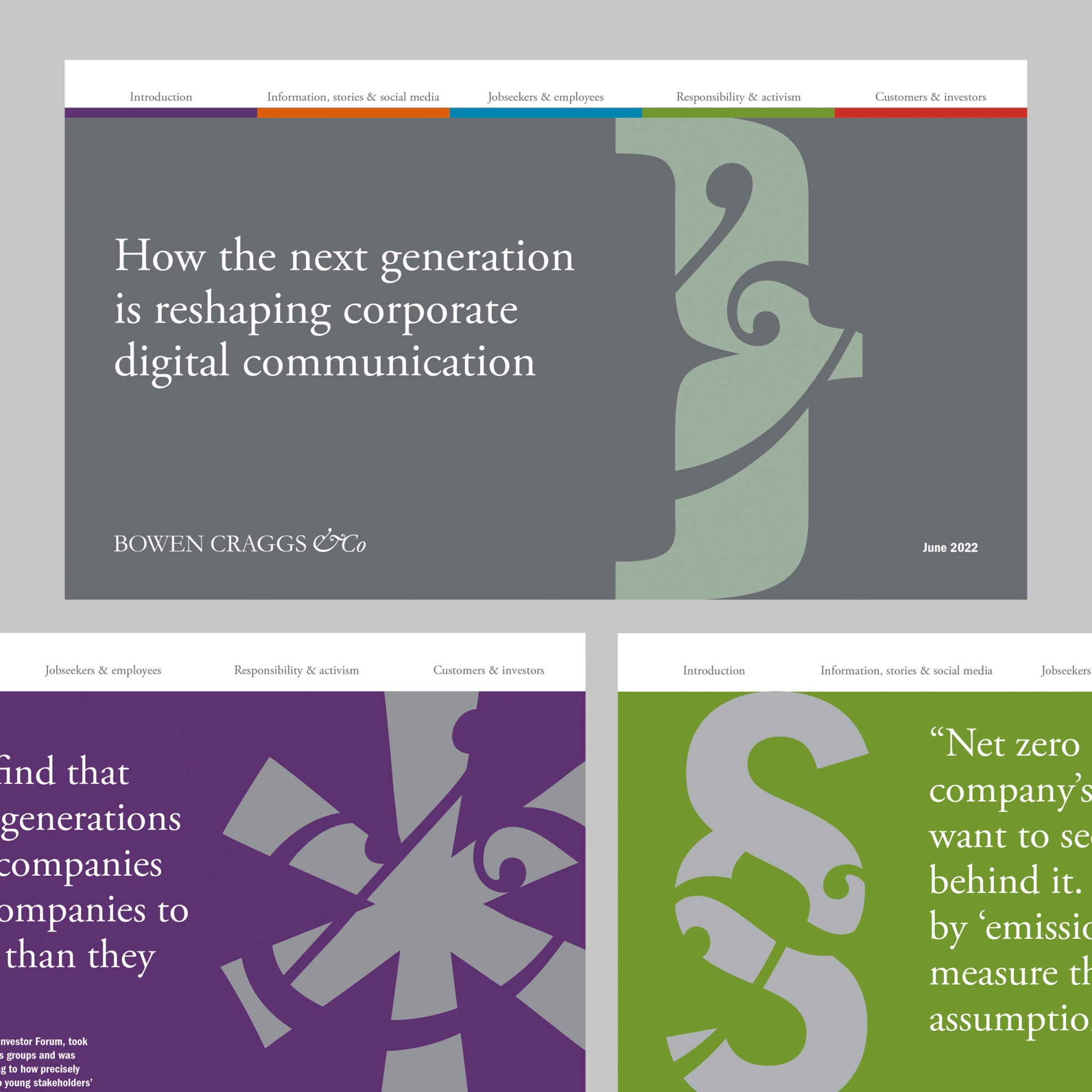
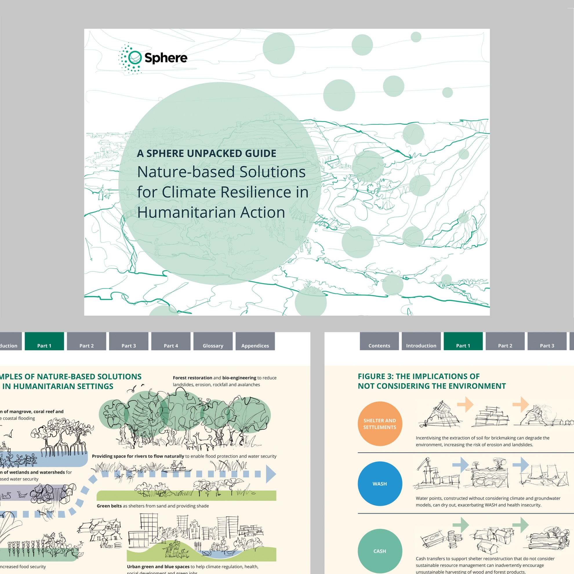
Generation Z voices have informed the design of this weighty publication, from infographics to navigation.
Part of a broader exercise looking at imagery and updating the brand guidelines, it’s also enabled us to join things up and meet new practical needs.
I’ve developed a type-based graphic approach that uses punctuation and glyphs from the visual identity’s two main fonts as visual metaphors for topics. It’s bold, writerly and brings in colour with a strength that’s a big move for this originally monochrome brand.
For PDF-only publication, I’ve been able to shift the format from A size to widescreen, which makes it easier to adapt for screen presentations.
I’ve integrated a slim band of colour used in the members’ area of the Bowen Craggs website and its email communications, here, used for navigation and colour-coding content.
The resulting design framework has been carried through to presentations for the Bowen Craggs 20th anniversary event.
And it all started with listening – which is one of the most interesting parts of design.
See more of my work with Bowen Craggs, on its brand, office graphics and portrait wall.


