Picturing standards
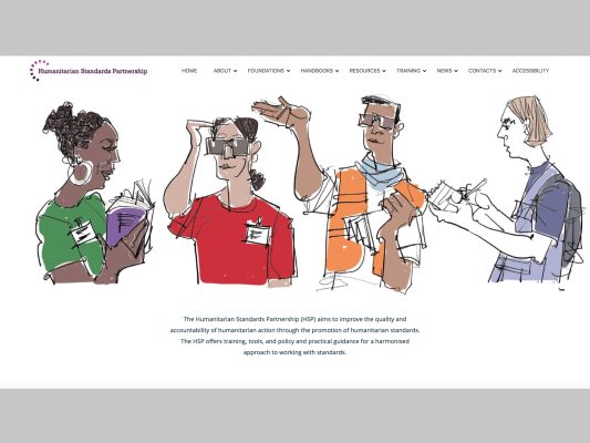
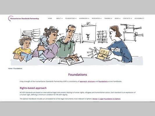
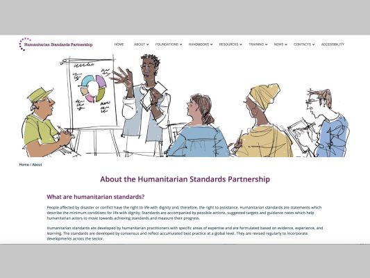
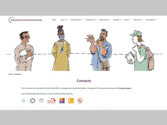
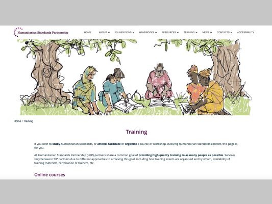
The Humanitarian Standards Partnership website is about learning and sharing best practice. And in a project combining design work on the styling of the website with sketch illustrations for its page headers, we’ve also had standards to meet.
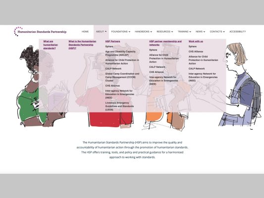
Exacting accessibility standards have driven a step by step design process. We’ve analysed, simplified, differentiated, emphasised and organised, all on a template created by the site’s developers. We’ve found ways to make cohesive use of diverse visual content. And everything has been through rigorous accessibility assessment, to inform design development.
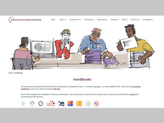
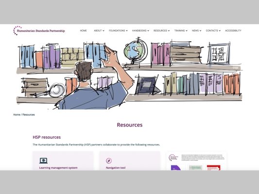
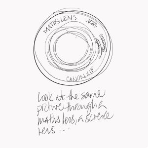
Sketch illustration has enabled the site to have page header images that reflect the ‘doing with’ approach of the partnership and show how things work. But it’s been about more than scene-setting – to work for accessibility, each illustration has to be clear and easy to describe verbally for audio description.
And the project has been a team effort with my client at Sphere, Tristan Hale, sharing and developing ideas at each stage.
Visit the website here.


