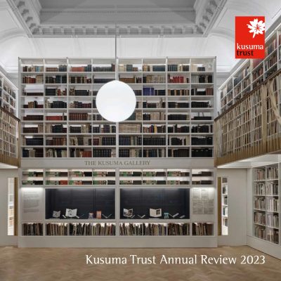
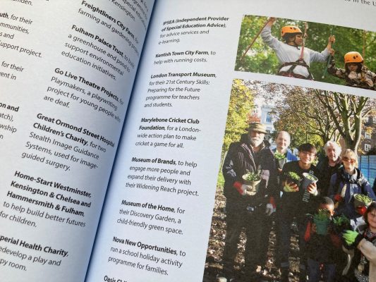
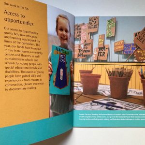
For my ninth annual review for Kusuma Trust, within its consistent design framework we’ve engineered the information differently.
There’s an editorial-style contents page with pictures. There are fewer sections of information, each introduced with a double page picture. And case studies have become a bigger part of the content.
Designing it is a collaborative process, to arrive at a review that tells the right visual stories for this family-led trust making philanthropic investments in causes, organisations and people that are making a positive difference to society.
And there’s more to it than layout – there’s the to and fro of assessing pictures, the broader collaboration of working with a good printer and for this edition, the careful work of designing in and setting up accessibility features for the PDF version.
The annual review is available online and as a small print run.


