From working for to working with
Clothworking was the strictly-defined craft of finishing wool cloth after weaving. The tools for the job were habicks (hooks) and teasels. Founded in 1528, the original purpose of City Livery Company The Clothworkers’ Company was to protect its members and promote their craft within the City of London.
The modern Clothworkers’ Company follows its traditions of membership, affiliations, charity and hospitality while engaged in the very modern business of being a crafts patron and funding innovative textiles research. It also has a charitable organisation, The Clothworkers’ Foundation.
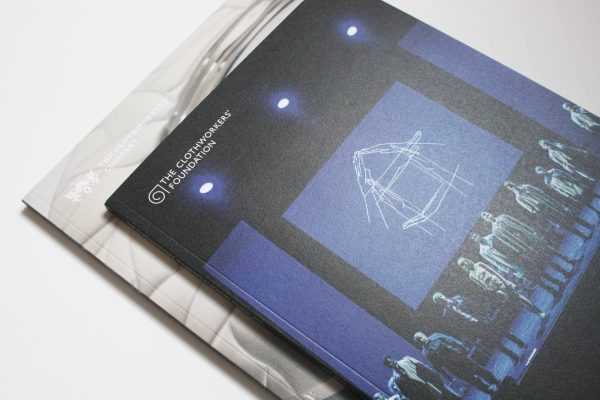
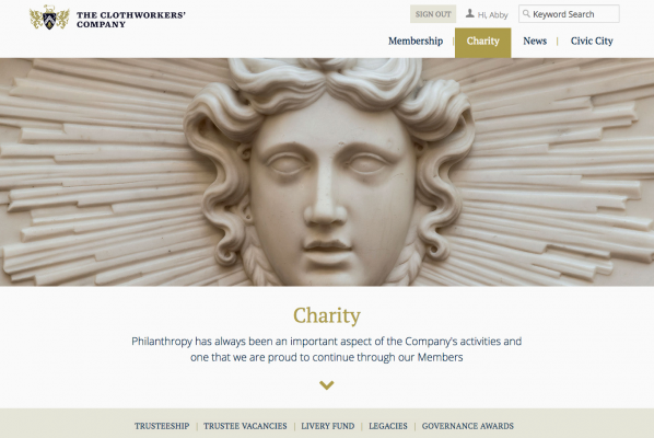
Following a brand update, The Clothworkers’ Company was keen to bring its communications into line. My initial brief was to look at the annual review for The Clothworkers’ Company and Clothworkers’ Foundation, at sourcing better pictures and at creating a look for the members’ area of the website.
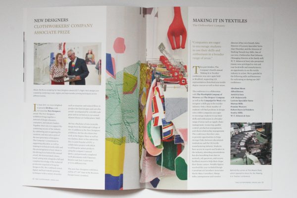
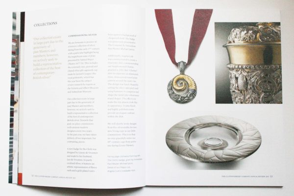
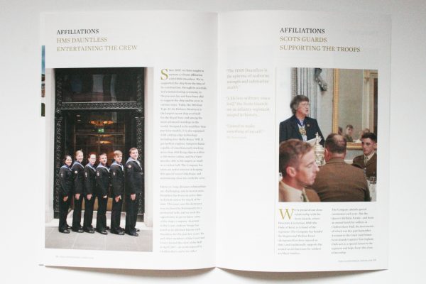
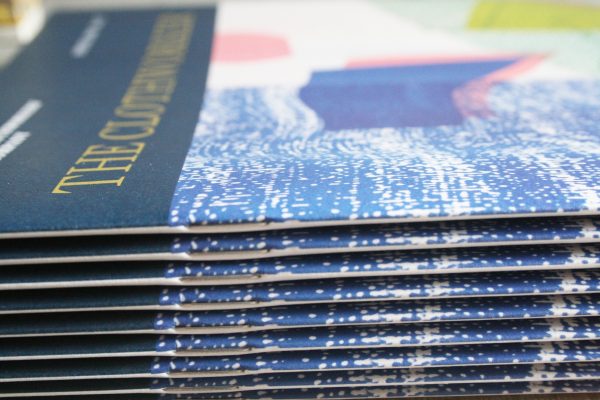
The Clothworkers’ Company and Clothworkers’ Foundation have distinct brands and tones of voice. So on the flip-format annual review, I went further than the brief by working out how to make the two brands play nicely together in a single design framework. I also introduced a more bookish format, tactile paper and a rigorous production process to reflect the craft values at the heart of the brand.
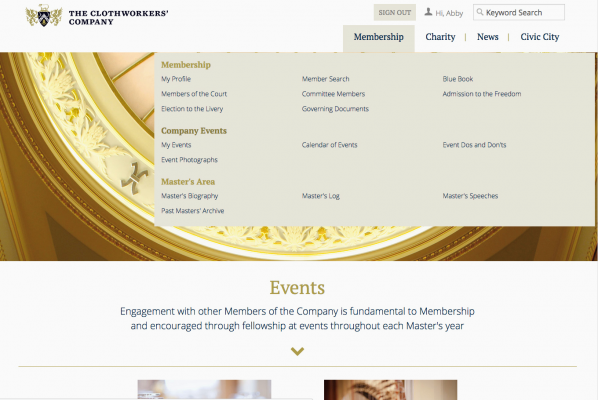
The members’ area of the website was to be elegant and usable. Nothing unusual there – but it also had to be achievable within the constraints of a membership management system. So early discussion with the developers was key to buildability.
Having seen some good pictures, I was curious to look into the pictures that The Clothworkers’ Company already had. The research paid off: instead of recommending additional picture sources with potential extra cost, I’ve helped the organisation to look differently at the resources it has.
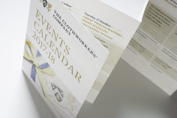
The programme of design has continued with redesigning the members’ supplement to the annual review, the magazine The Clothworker, the events calendar, membership listings and designing an exhibition panel for its Chris Ofili tapestry The Caged Bird’s Song.
As The Clothworkers’ Company’s own design capacity has grown, the design relationship has evolved. I’ve templated the print materials for in-house implementation. And I’ve art directed the new Clothworkers’ Foundation website, built by Woven Agency, to bring it into line with print communications and make it an easy-to-use site for grant applicants.
It’s been a shift from working for to working with.
The Clothworkers’ Foundation website can be found here;
The Clothworkers’ Company annual review can be found here;
The Clothworkers’ Foundation annual review can be found here.


