

Purpose… and purpose.
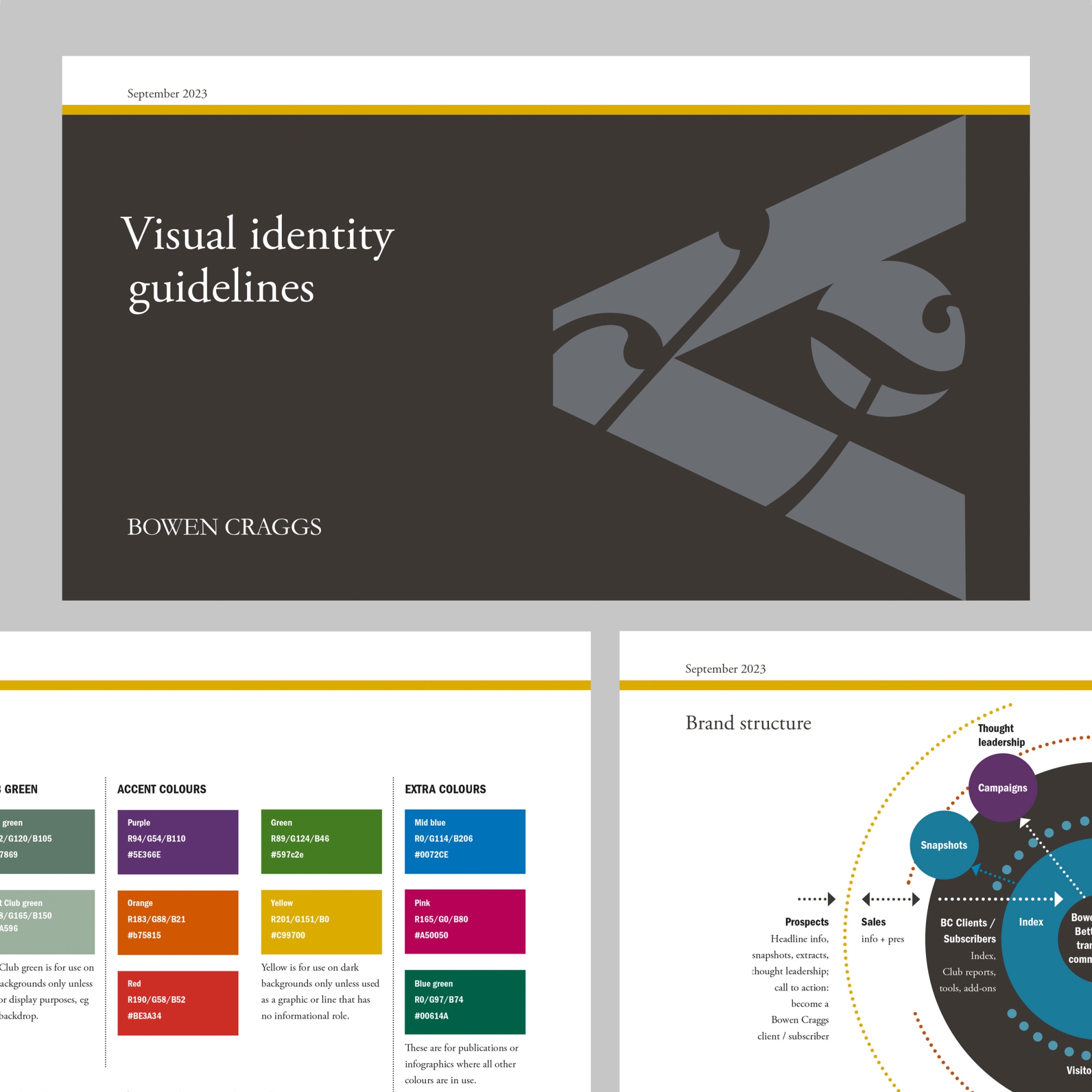
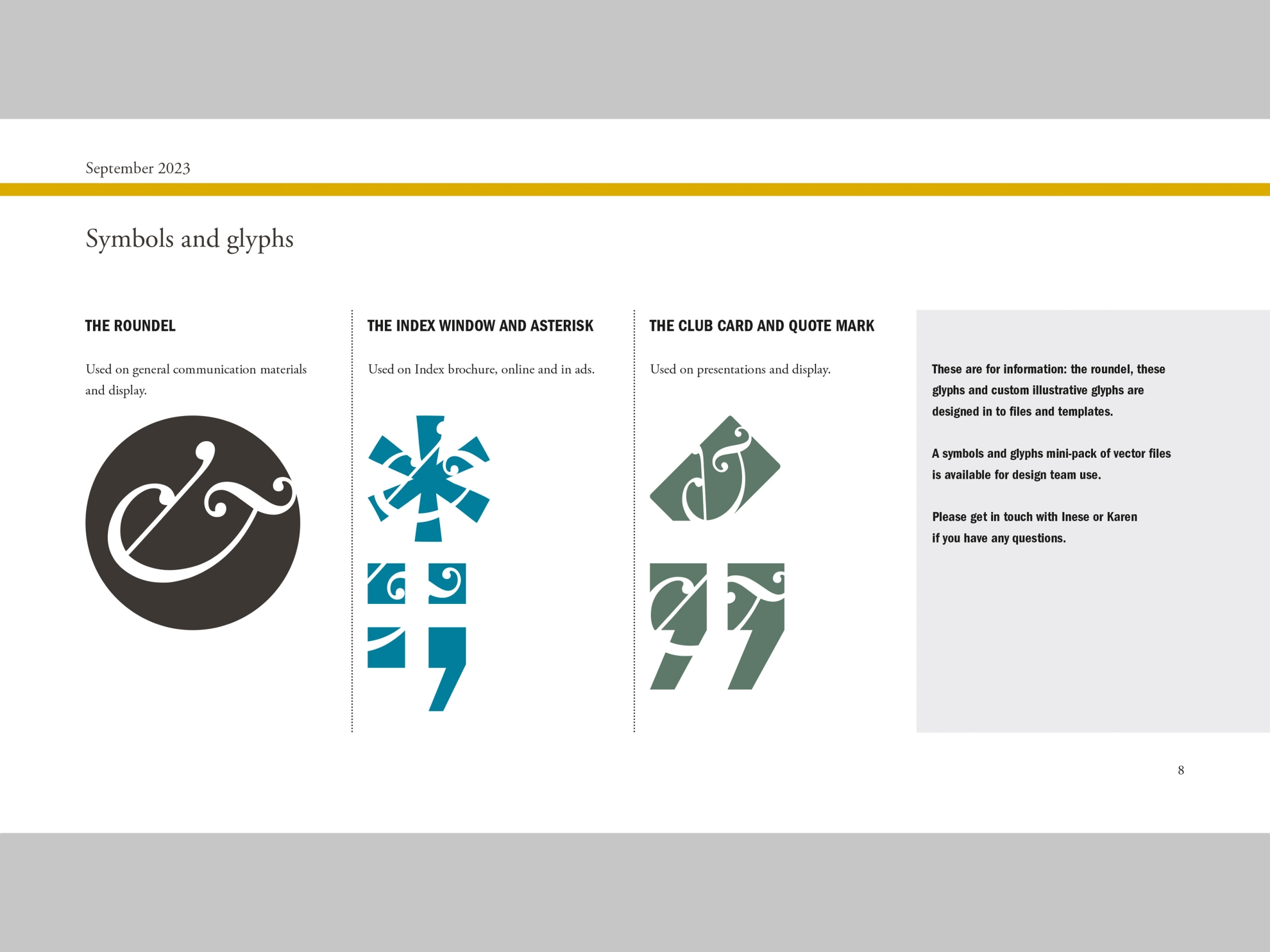
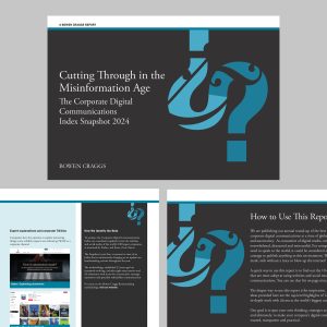
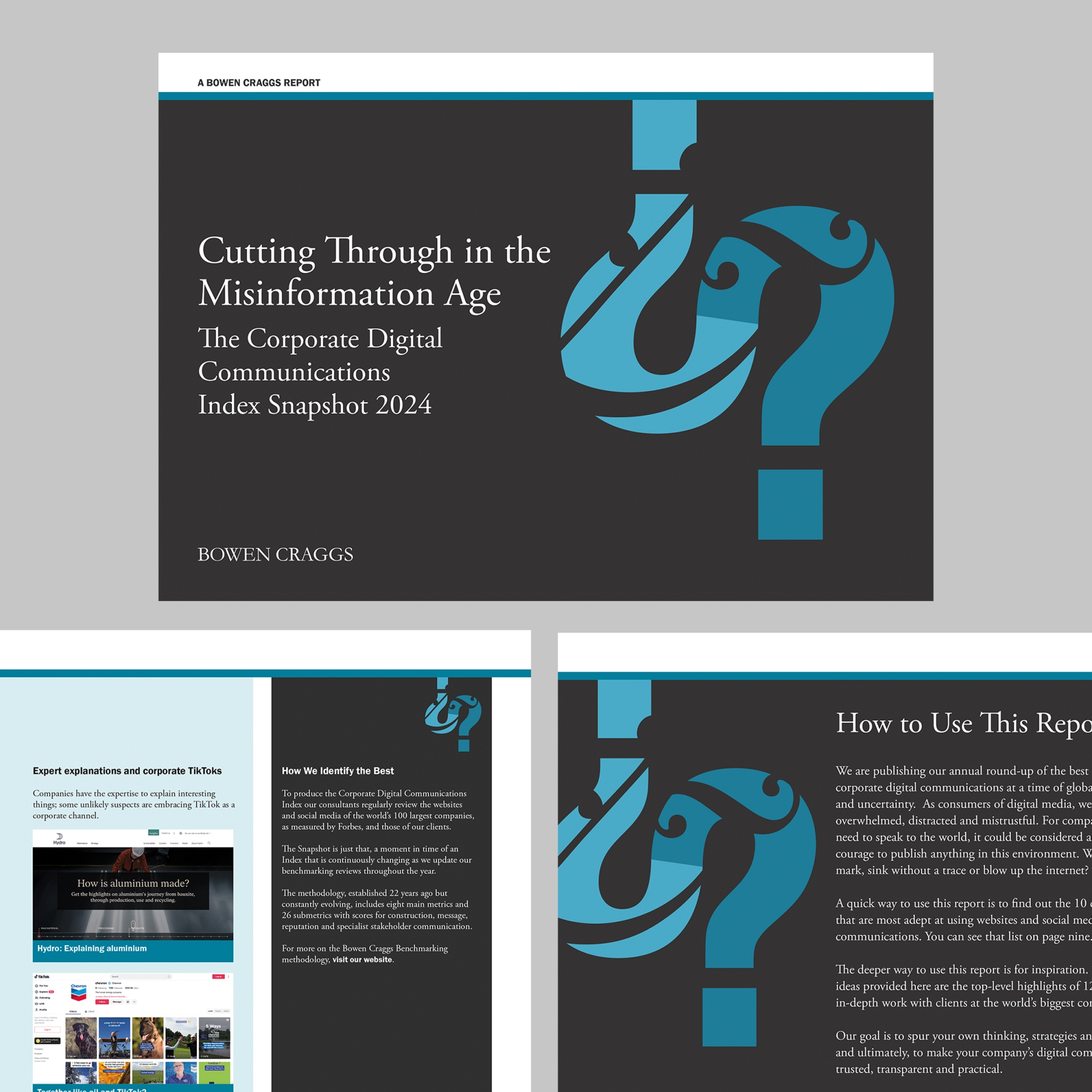
It all started with Generation Z. In the design of a report on how the next generation is reshaping corporate digital communication, a bold, punctuation-based visual language has emerged for this writerly brand. But we haven’t used it everywhere.
Bowen Craggs exists to lead the charge for clearer, more trusted digital corporate communications. As the company has grown and its communications have evolved, we’ve used some of that clarity to look at the structure of the brand and to set out visually the company’s purpose and values.
The structure has informed our brief for the company’s new brand guidelines and resources. We’ve identified the right style and tone for each part of the company’s communications. We’ve looked at purpose practically, designing the brand guidelines for their primarily-internal users.
We’ve rethought templates. We’ve simplified processes. We’ve looked at who does what. We’ve tackled software challenges. We’ve considered admin in two continents. None of which is stuff you can see – but it’s important in designing things that people can use.
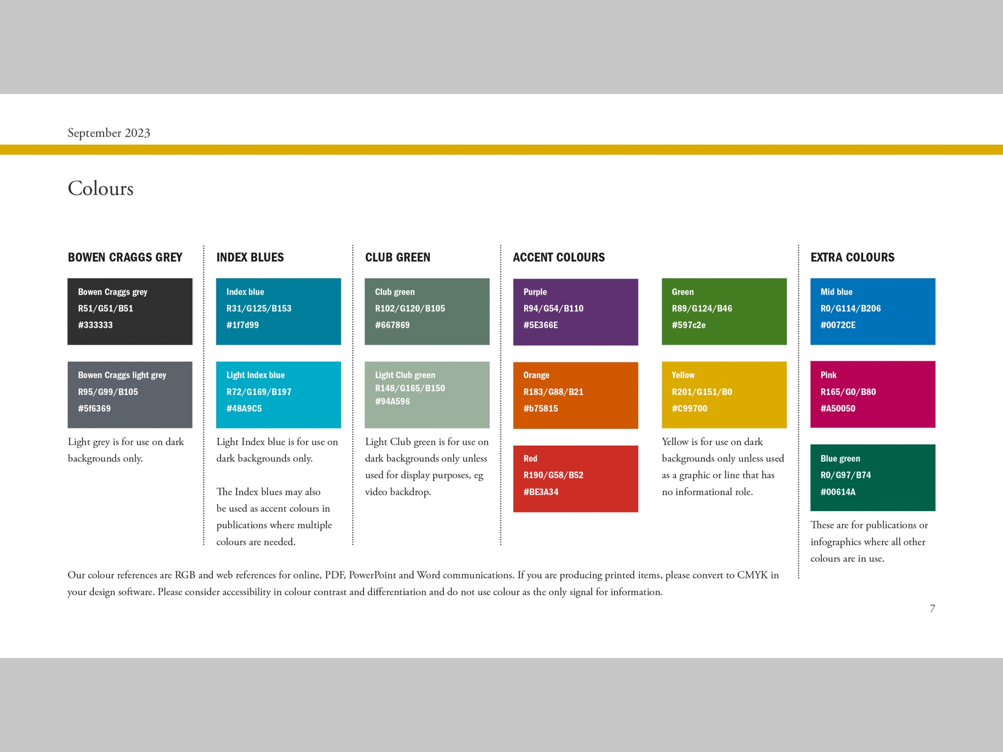
Our next step has been to review the guidelines and PDF publications for accessibility. That’s involved collaborative work, designing in a new colour palette from Jon Wallace’s accessibility work on the website. We’ve added prompts to the guidelines for creating accessible documents. And we’ve created a guide for staff creating accessible reports and publications in InDesign and Acrobat Pro. The listening and learning involved has changed the way I think about layout – more on that in my blogpost What does a layout sound like?
