


A sense of identity
Walthamstow School for Girls is a state school with history, quality and ambition.
With a changing demographic and new competition, the school wanted to be able to present itself to new audiences in a way that resonated with staff, students, parents and existing local communities.
The most important piece of work turned out not to be design but co-creating the brief. Test creative work enabled the school to dig deeper into its identity through a series of discussions and consultations. This gave us all a picture of the jobs that design needed to do – and equally, that it shouldn’t feel like commercial branding.
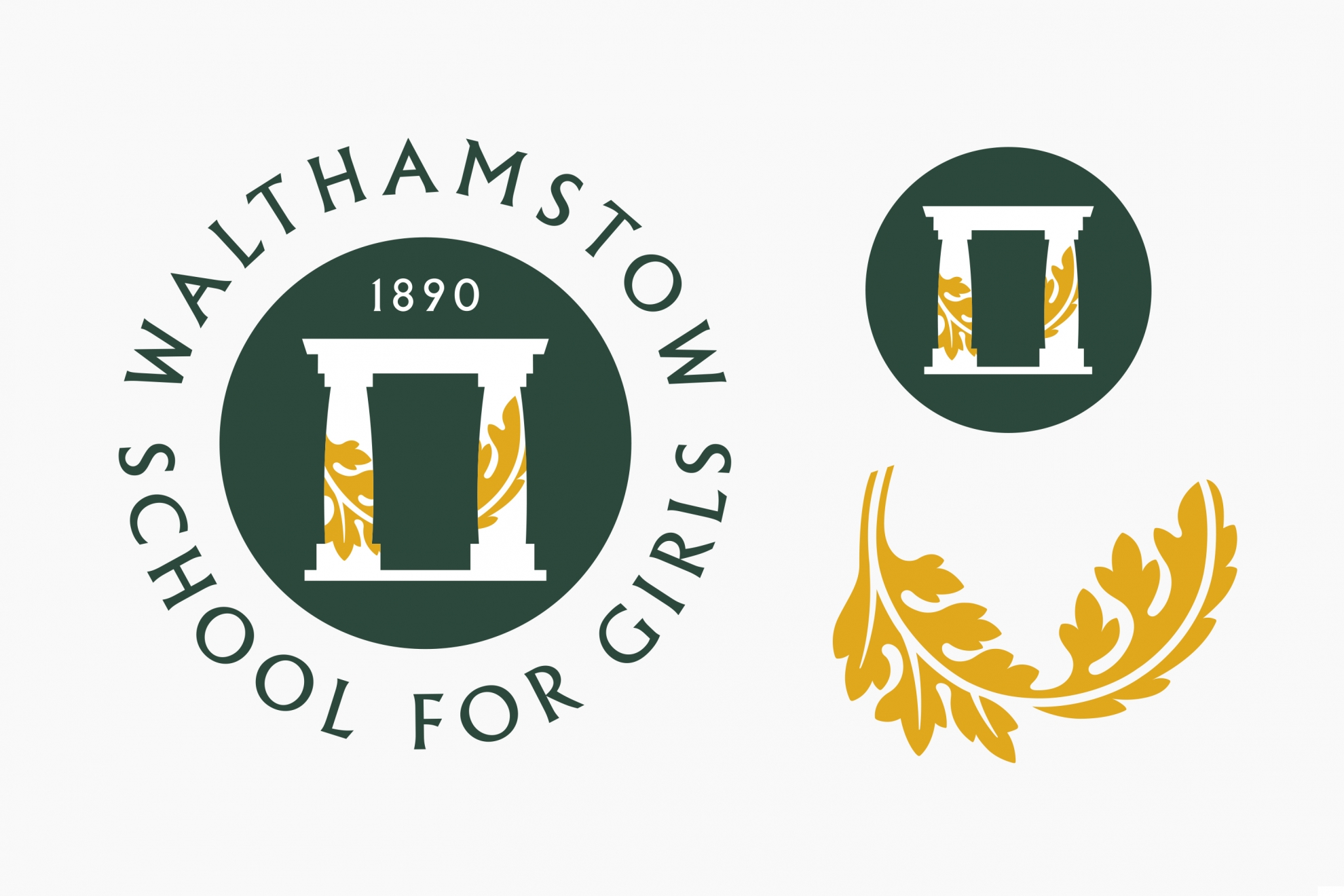
Working closely with the school, I engaged in a step-by-step process of design and project planning. The result was a visual identity that drew elements from the school’s heritage, its character, its architecture and its values in a way that subtly incorporated modernity.
A complex toolkit of badge formats to meet the school’s needs was set out in succinct identity guidelines.
Print and uniform choices were driven by affordability, local production sourcing and environmental considerations – the jackets are made from recycled bottle tops.
Signage was simplified for ease of production and greater longevity.
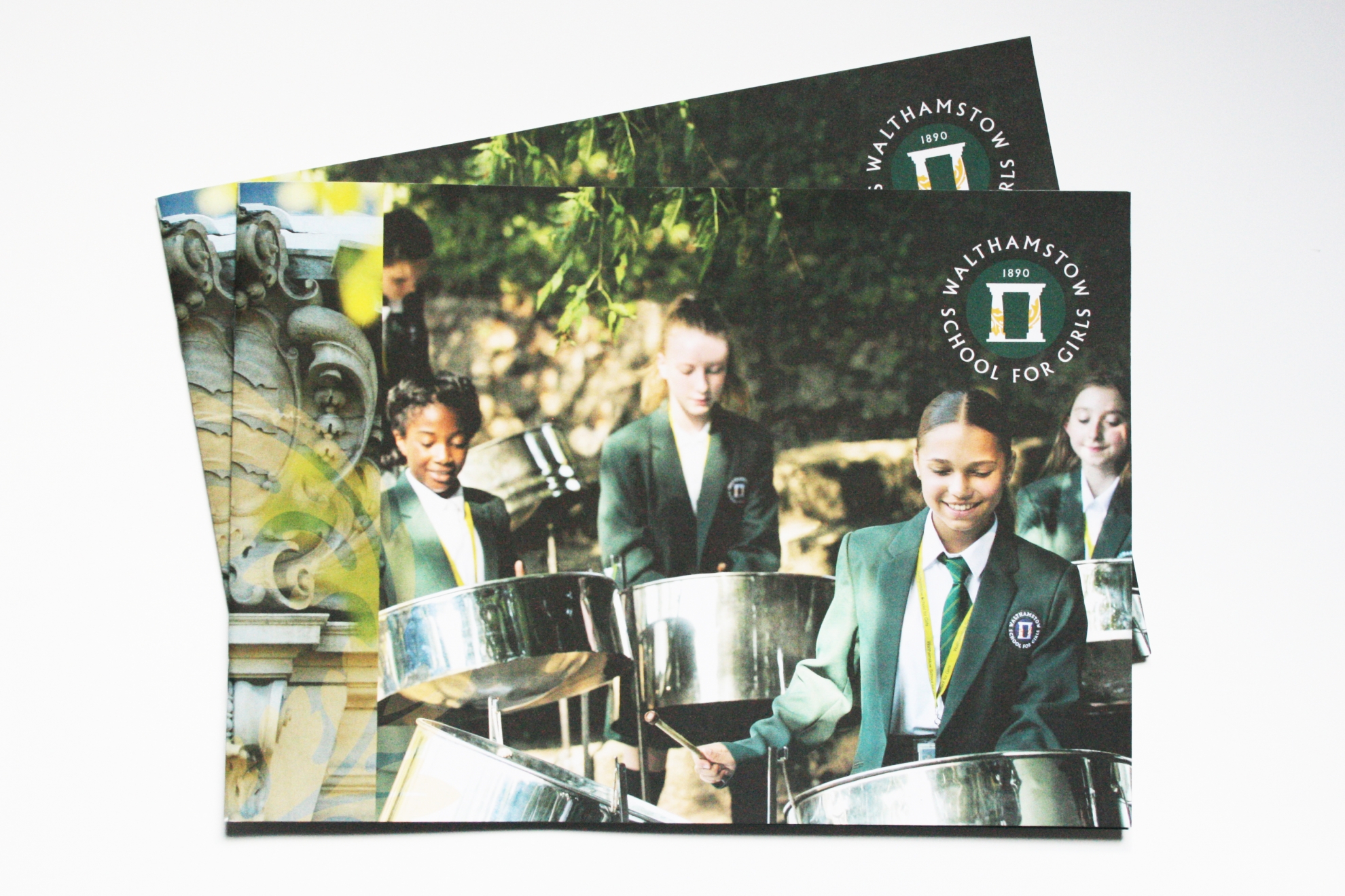
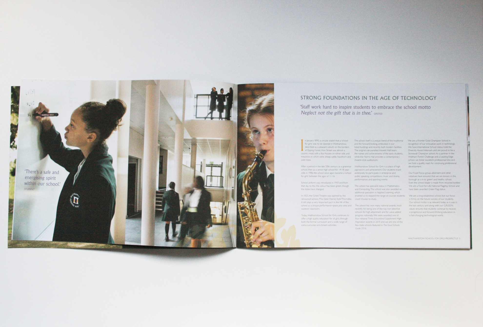
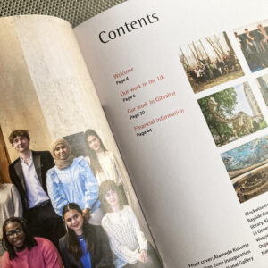
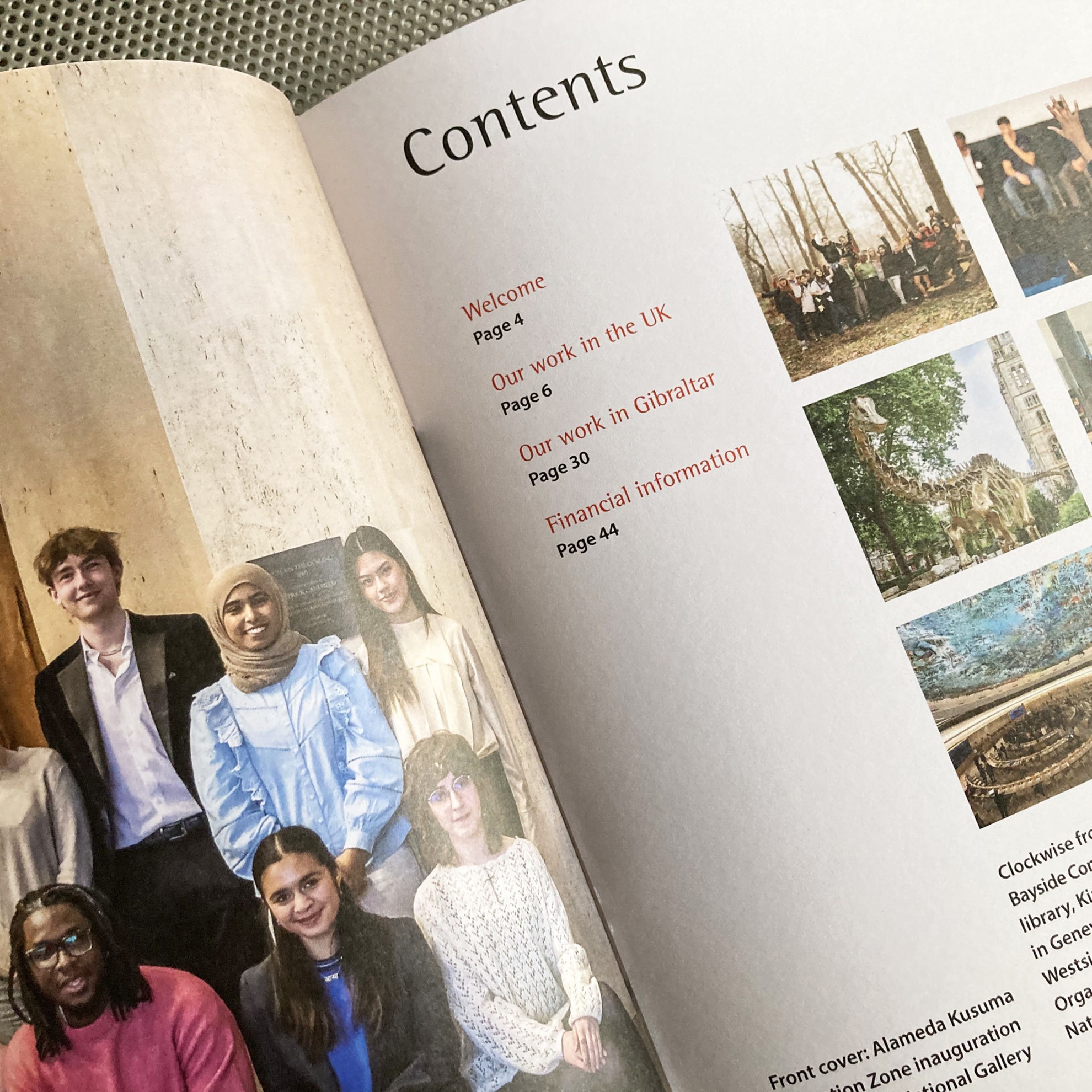
For the prospectus, I kept the factual approach that the school valued, added fresh photography to communicate the school’s lively, engaged atmosphere and created a layout with a skimmable level of information for new, time-poor audiences.
Photography for the prospectus by Lydia Evans
Website by E for Education


