
Outdoors, in symbols...
A sub-brand and a set of icons. Surely, that’s just a quick job of making some symbols?
Well, no. To make the design relevant and useful, my process for this project with LUC for Barnet council started with a walk. Why? Because the spaces that design needed to work for were hugely varied and there’s no better way to understand a space than to turn up and explore. I explored online too, looking at information and social media.
Then I delved into communications context, looking in depth at how the brand worked, how its sub-brands worked, where the overlaps might be between sub-brands, likely collaborative contexts and integrating new information about regional plans.
And there were people to consider – park users, internal audiences and finding a helpful working method with Barnet’s main design supplier.
As part of design development, there were stages of accessibility testing.
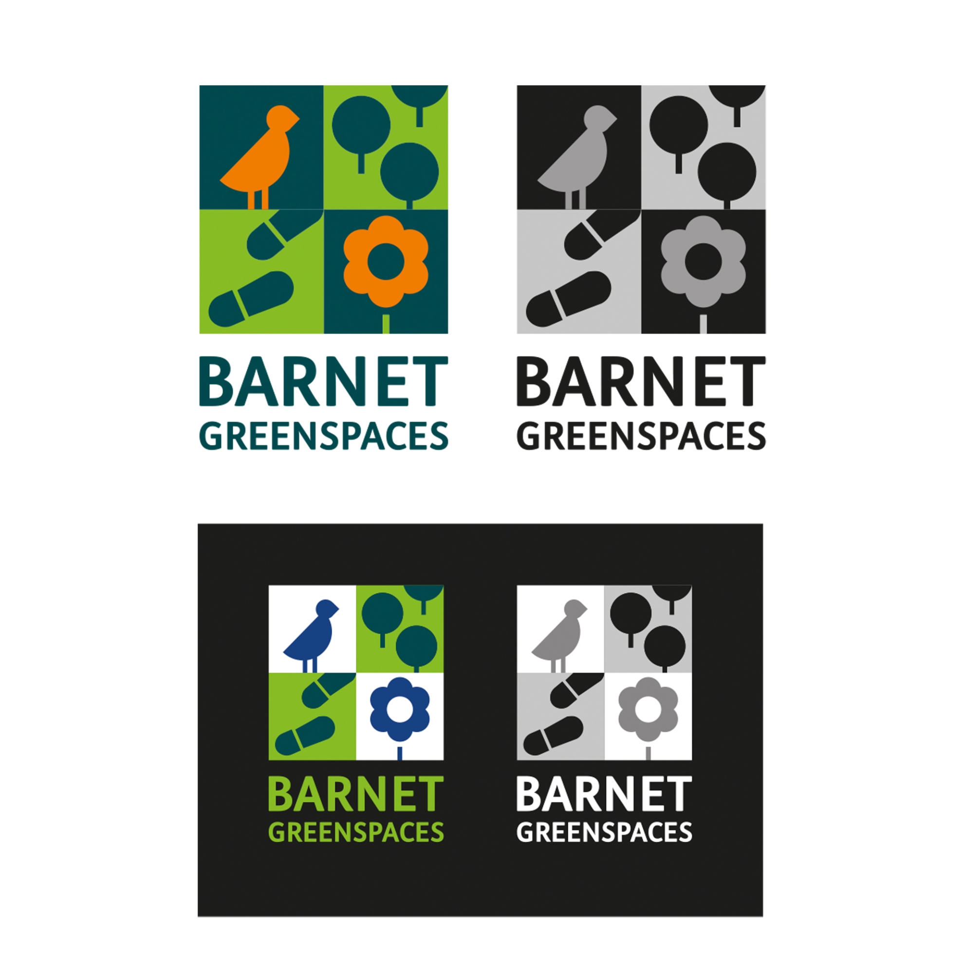
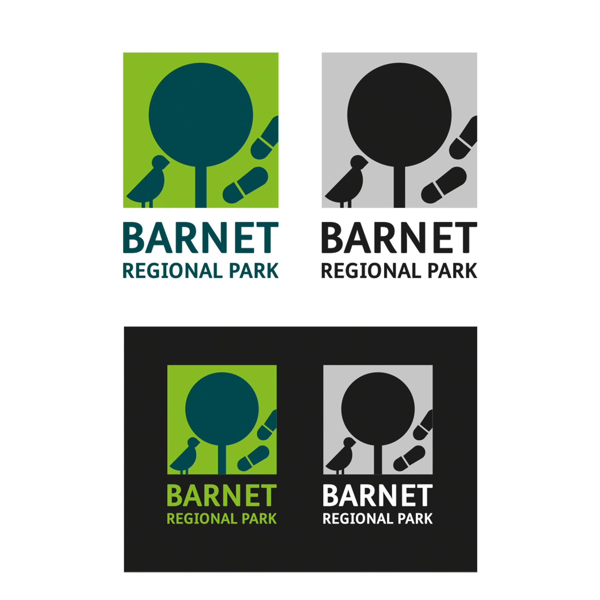
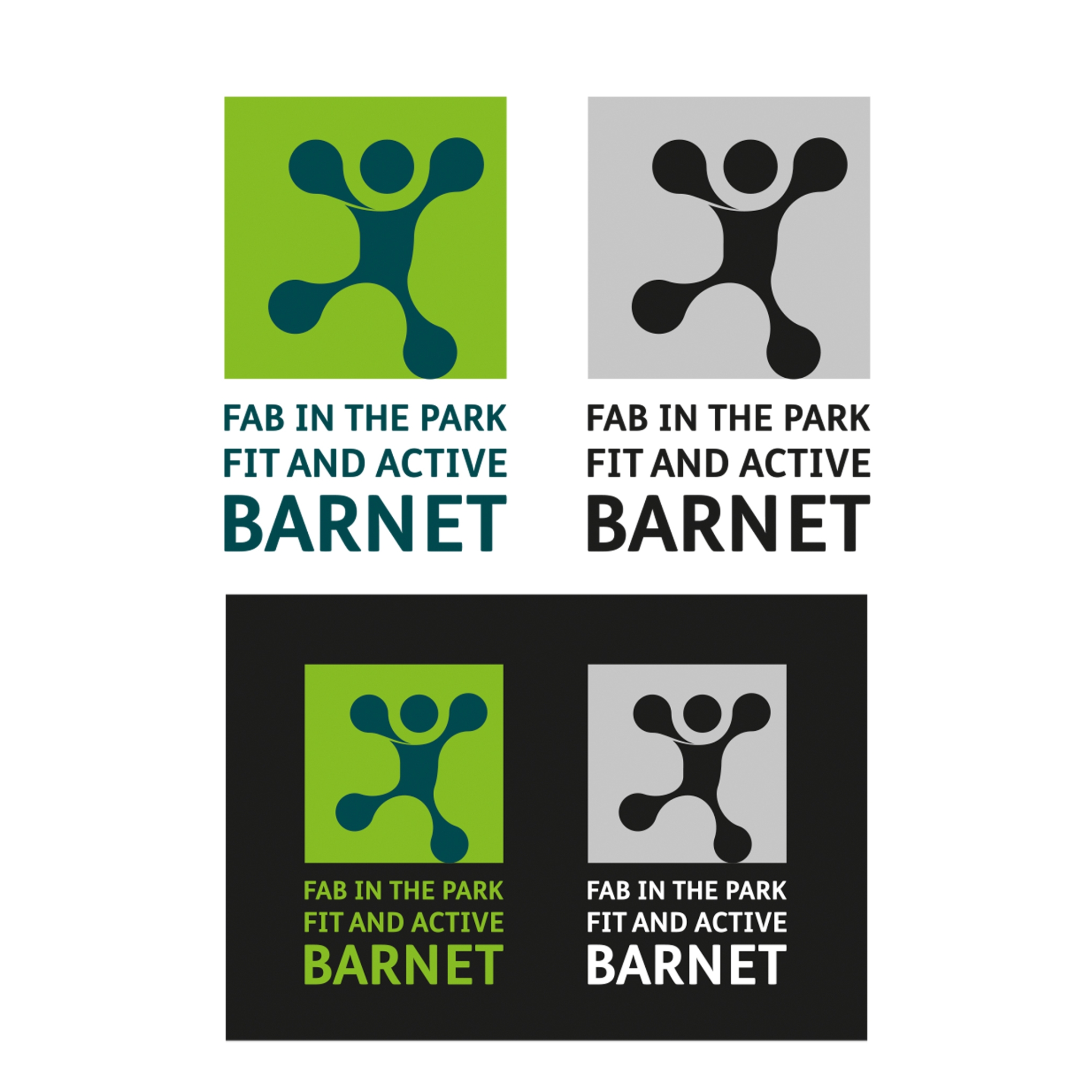
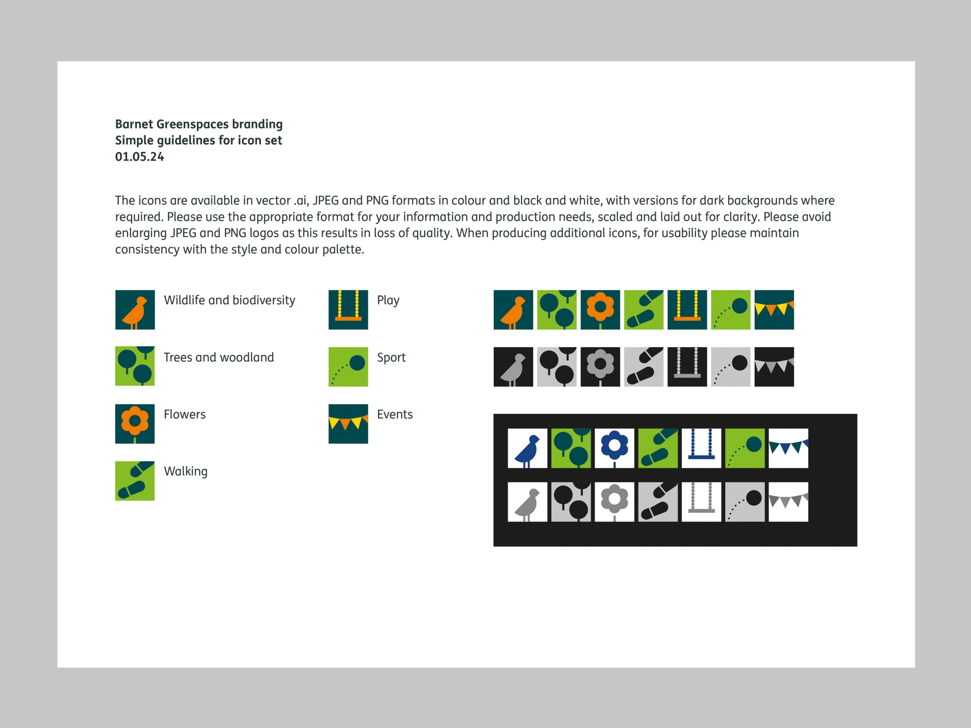
Finally, there was an extensive process of artworking, producing three logos and seven icons in colour and black and white, in three formats for screen and print, and guidelines for implementation.
So yes, a sub-brand and a set of icons. But like the water birds in the park, the project had a lot more going on beneath the surface.


