Adding flavour...
One thing that’s always interesting about working with clients over time is that even the most apparently traditional organisations don’t stand still.
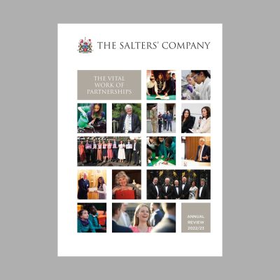
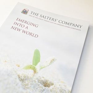
This third annual review for the Salters’ Company is full of energy, with news of new partnerships, expanded education initiatives and this year, a brief to make the design communicative to new external audiences as well as the Company’s fellowship.
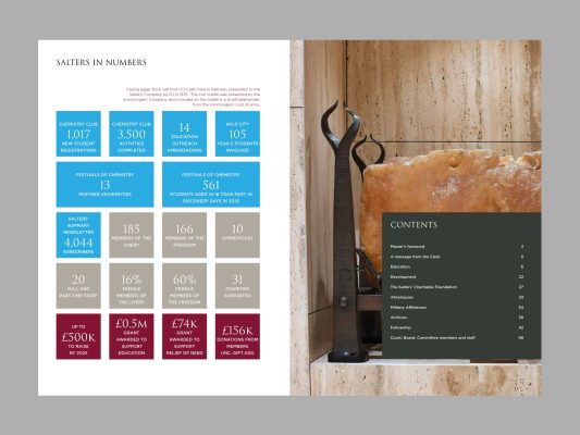
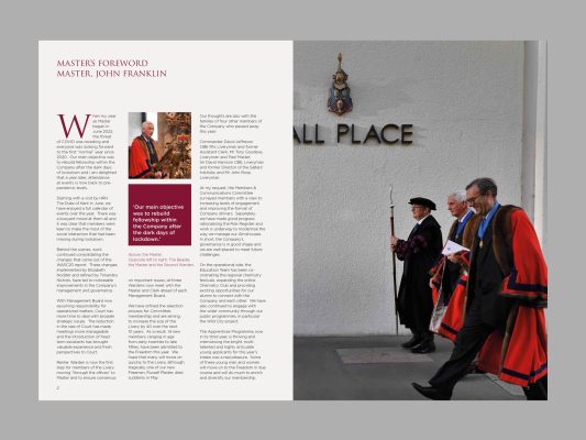
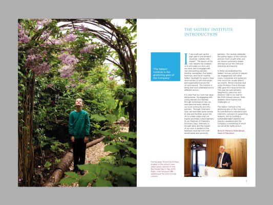
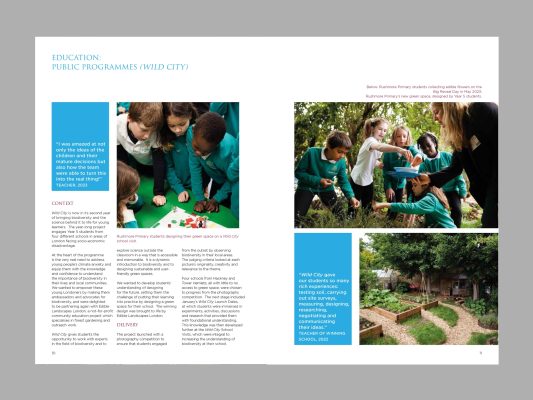
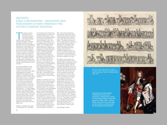
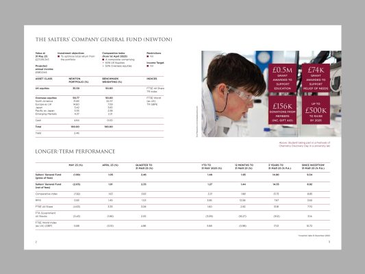
In a year like this, it’s impossible for one image to distil everything that’s been going on so the cover is a snapshot of the year. Inside, big pictures add presence and visual breaks between topics. Backgrounds differentiate internal and external content. There’s a separate financial supplement, enabling the review to be usable as a ‘what we do’ piece.
And there’s more to the job than layout – creating the annual review also involves process design, flexibility in responding to a variety of voices and informational requirements, knowledge on image use and experience in production management.
As I pause in the beautiful Salters’ Garden, joining its brutalist building with a section of London Wall, what I always care about most is that the annual review does a good job as a showcase of the year’s work and affiliations at this venerable and at the same time, thoroughly modern City Livery Company.


