We’re going to need a bigger report...
As a designer, I spend a lot of time whittling things down. Out go repetition, things that people don’t need and graphics that don’t have a job to do. Less is more.
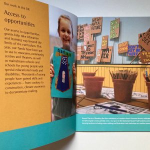
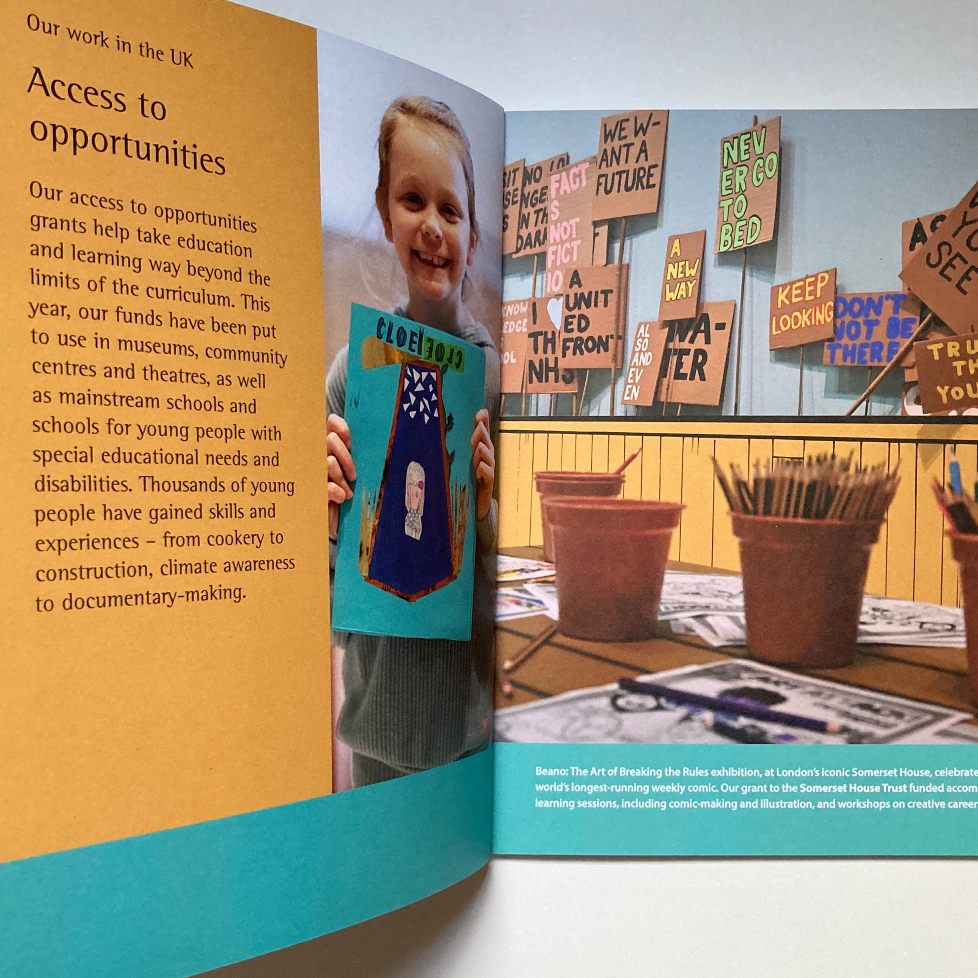
…Except when you want bigger text. Applying accessibility standards we’ve brought in on other materials, to avoid cramming (which can make well-intentioned text size changes harder to read) we’ve had a choice: fewer words or more pages. It turns out that Sphere’s members around the world have been busy so there’s a lot to say. More pages, then, to tell those stories clearly, but with a functional, information-focused design that allows space for readability but does that in as few pages as possible.
This year, there has also been a print run to consider so the previously PDF-only annual report has been designed as double page spreads, so that it looks balanced in print.
There are subtleties for screen readers – the contents list has been reconfigured so that it makes sense when read out loud.
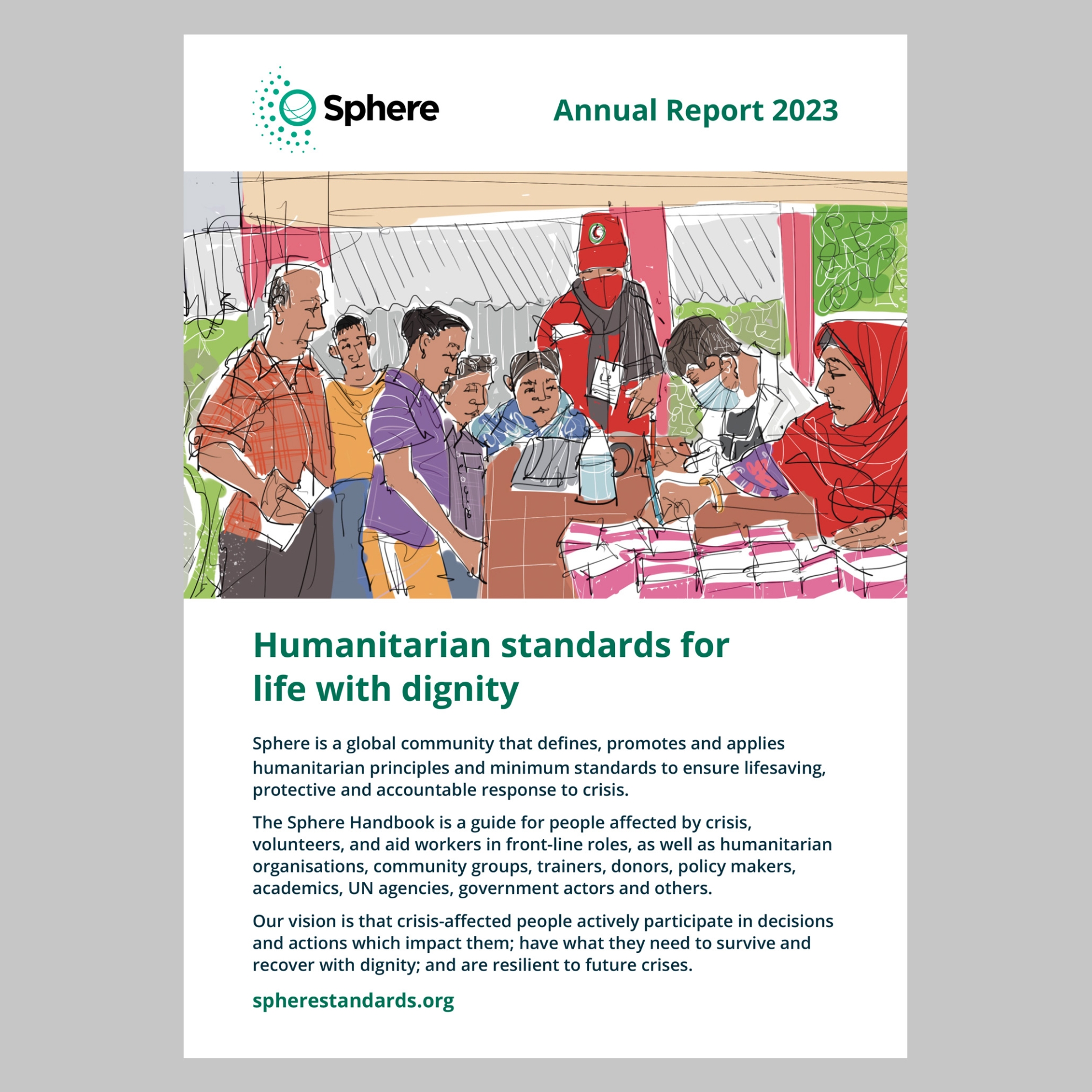
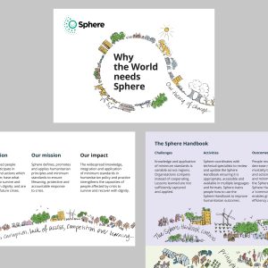
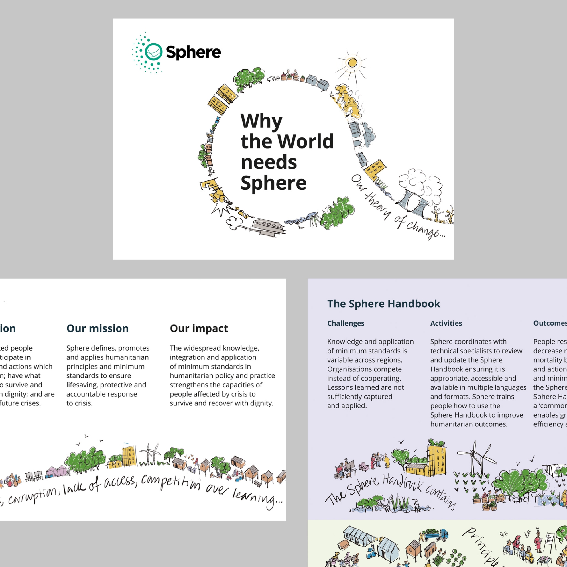
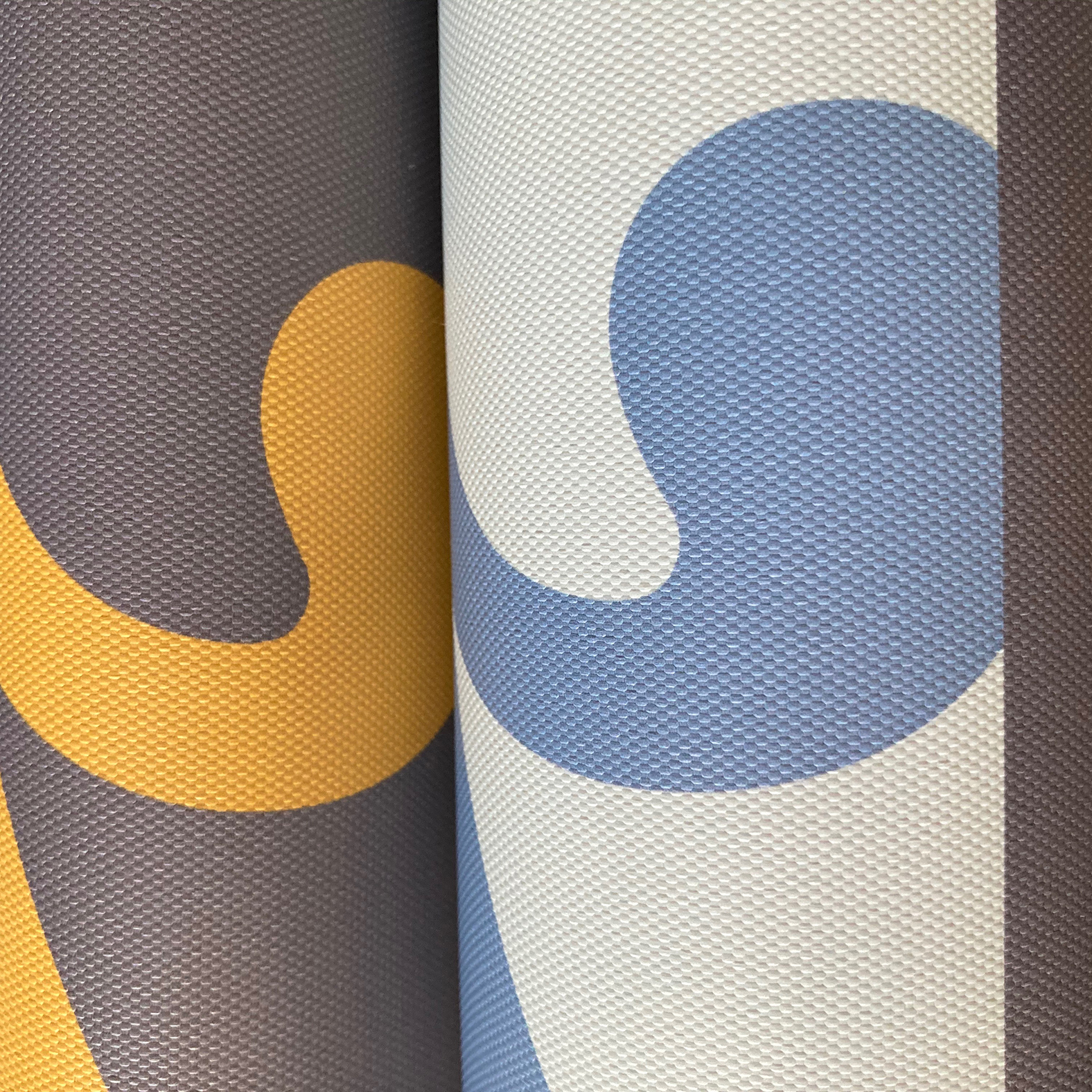
And so that it sits well with recent materials to help present a consistent picture of Sphere’s work, I’ve produced an illustration for the cover.
It’s all part of a body of work with an organisation that likes its communications to be as useful as the standards it promotes.


