Type as image; testing accessibility...
“Could we have some sweary type?” is possibly the best request I’ve ever had at a briefing meeting.
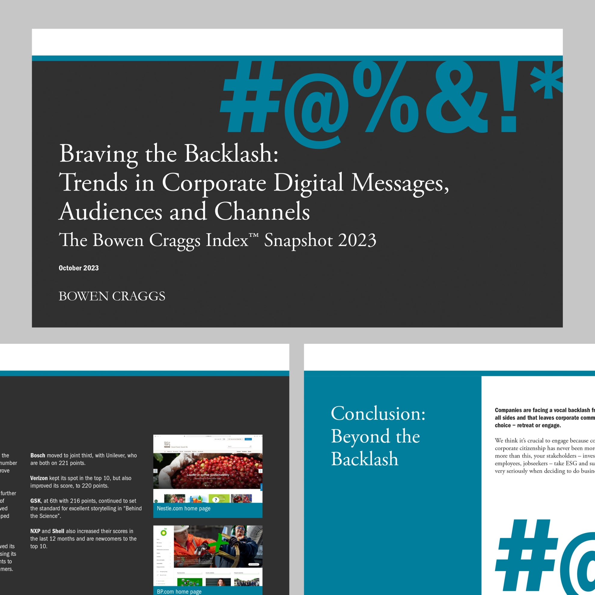
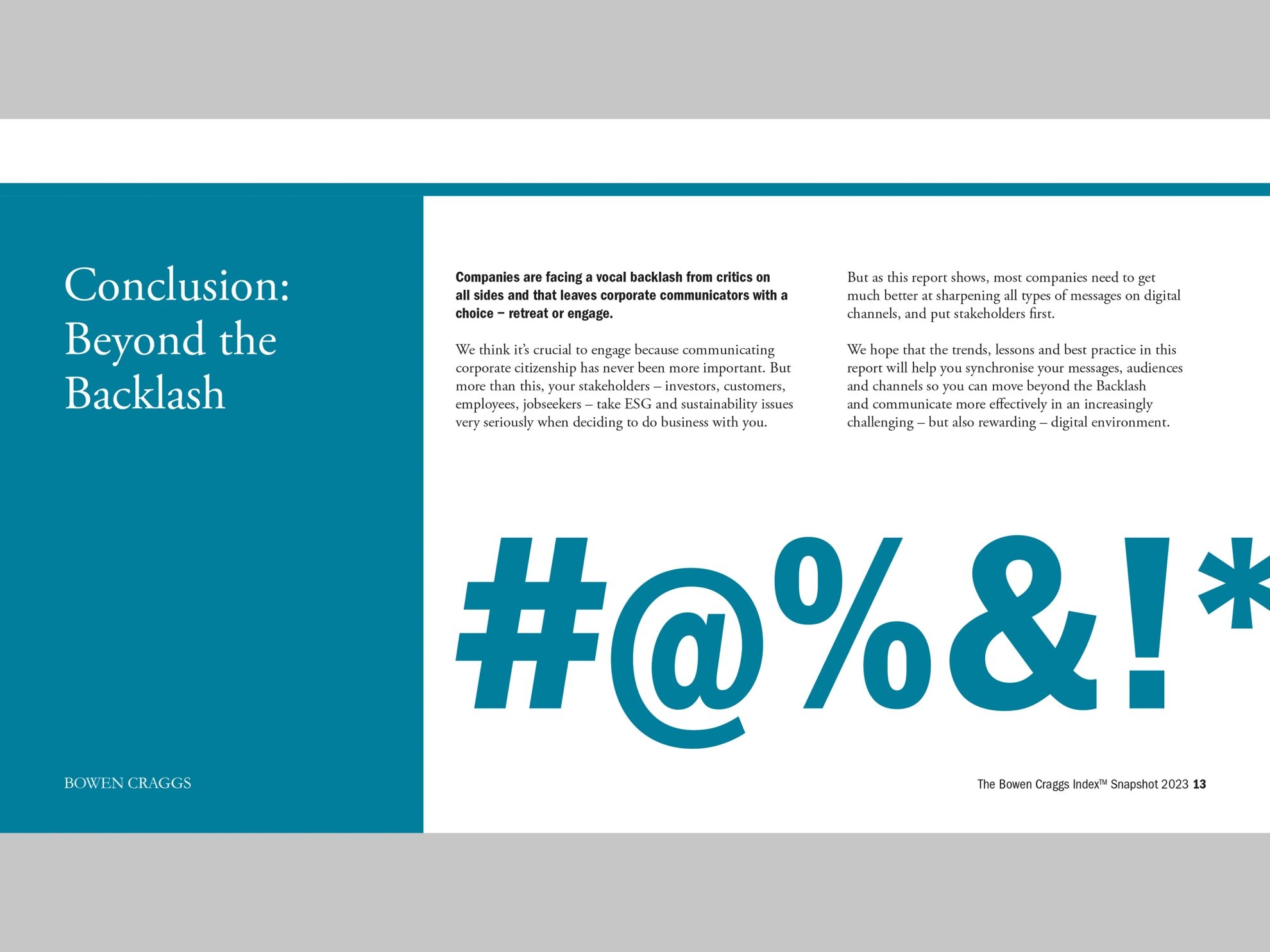
And there’s a point to it. In a brand identity where we use glyphs as a form of illustration, a grawlix (an angry assemblage of punctuation marks, more of which, another time) communicates at a glance what this report is about – the corporate digital communications backlash.
The layout of this report has also been a chance to use and extend the work we’ve been doing to design accessibility in to PDF publications, doing as much work now on the engineering of the page as we do on its look and feel. More about that on the studio blog.
Read more on the Bowen Craggs brand review.
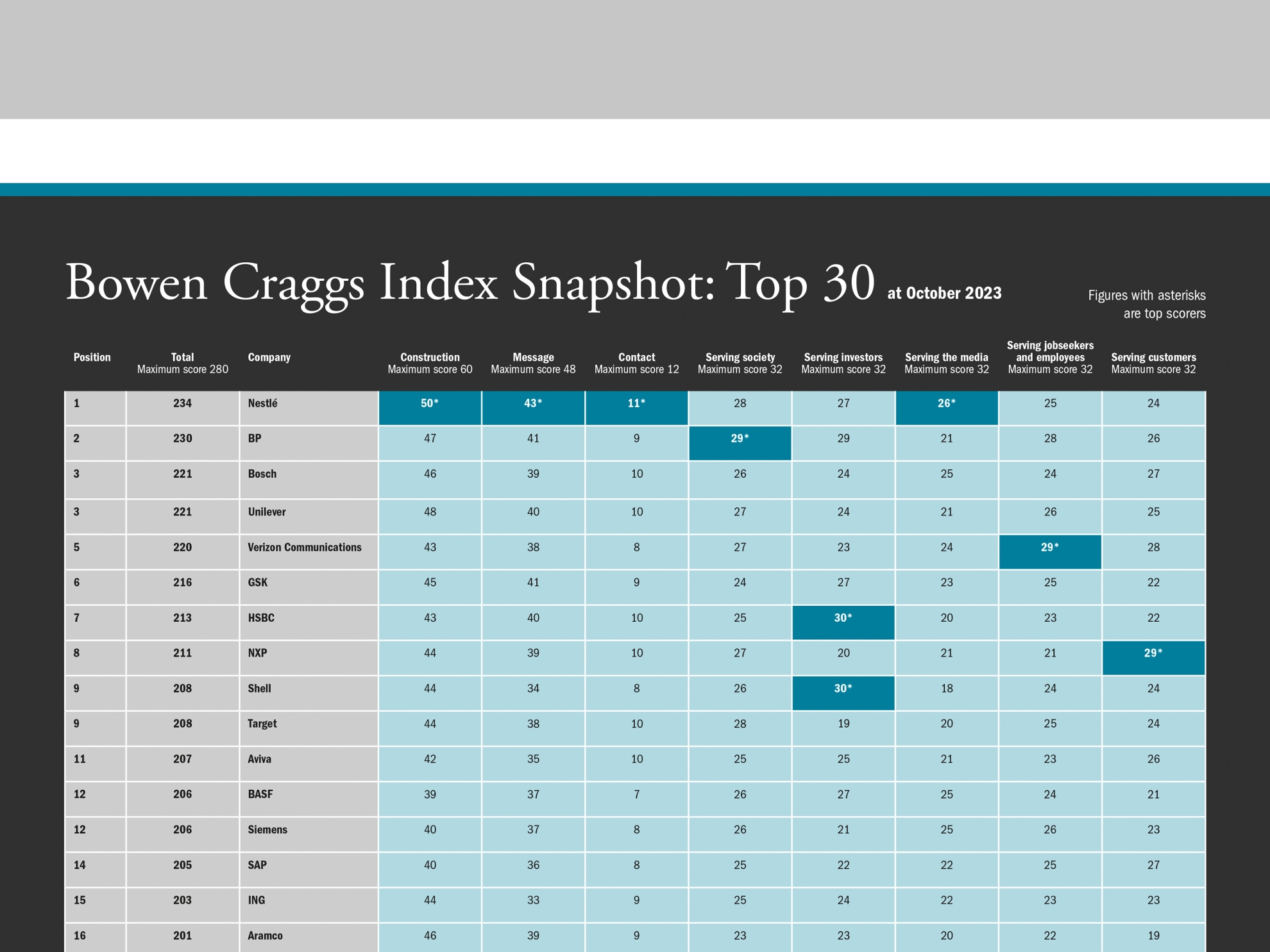
Find the Bowen Craggs Index.


