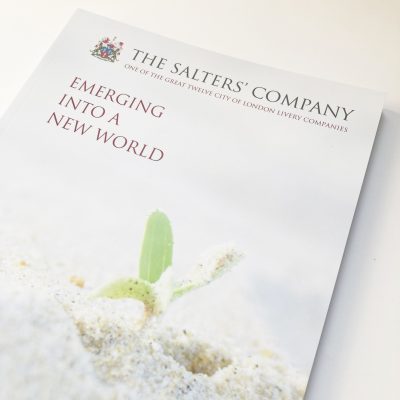
Emerging into a new world...
A second annual review for an organisation needs to look related to the first but speak of a fresh theme and tell a new set of stories.
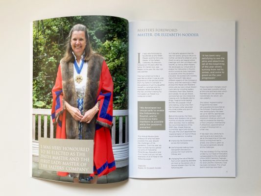
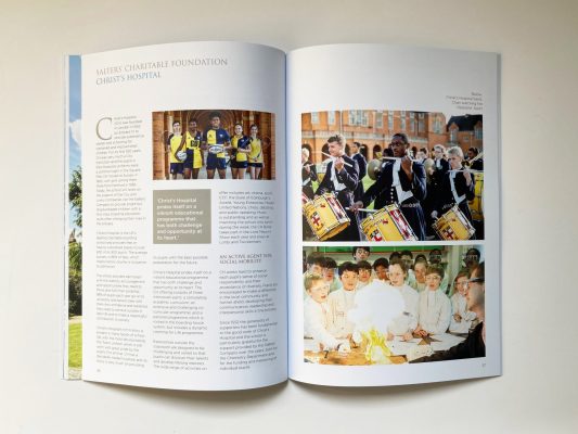
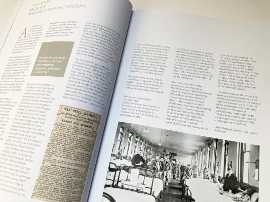
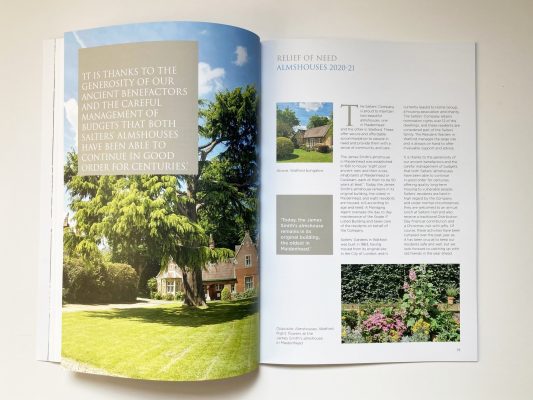
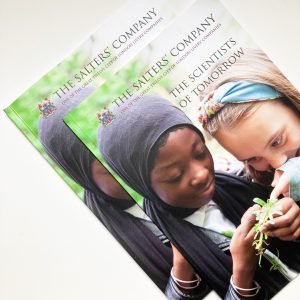
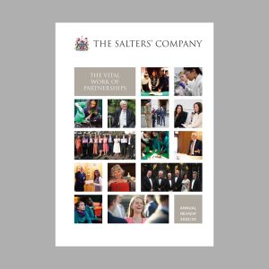
The brief for this year’s annual review for The Salters’ Company has been to reflect its successes in tackling the challenges of the pandemic and in particular, its work with young people, in a picture-led way.
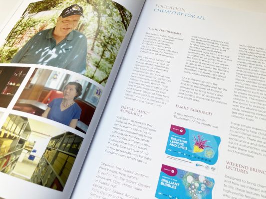
But how do you do that when a lot of the events have been online, some stories have no pictures at all and this year’s schedule has required everyone to work to a much shorter timeframe than normal?
Well, that’s where my editorial design experience comes in. Magazine design is a collaboration between design and editing. I’ve learned to be proactive, pulling picture possibilities out of the words and thinking on my feet. So I’ve delved into stories, watched and made screenshots from videos, done picture research – and redesigned the working method too, to enable us to do more in less time.
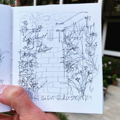
With The Salters’ Company’s sterling teamwork and a helpful printer, we got there on time. And on proof-checking visits, I even managed to sketch the Salters’ Garden, the beautiful public space that stitches together the modern Salters’ Hall and ancient London Wall.


