
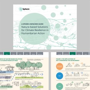
Collaborative design with Sphere...
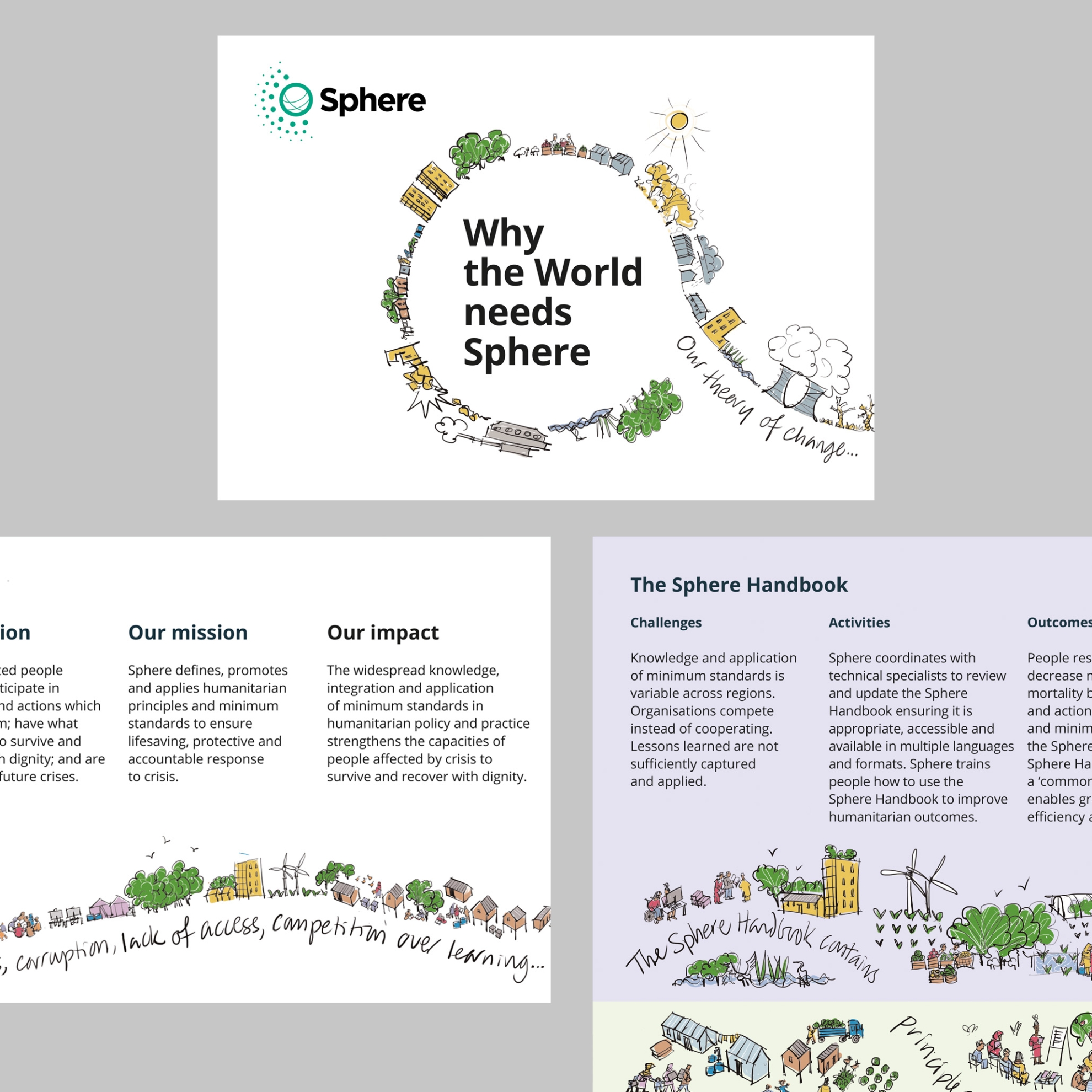
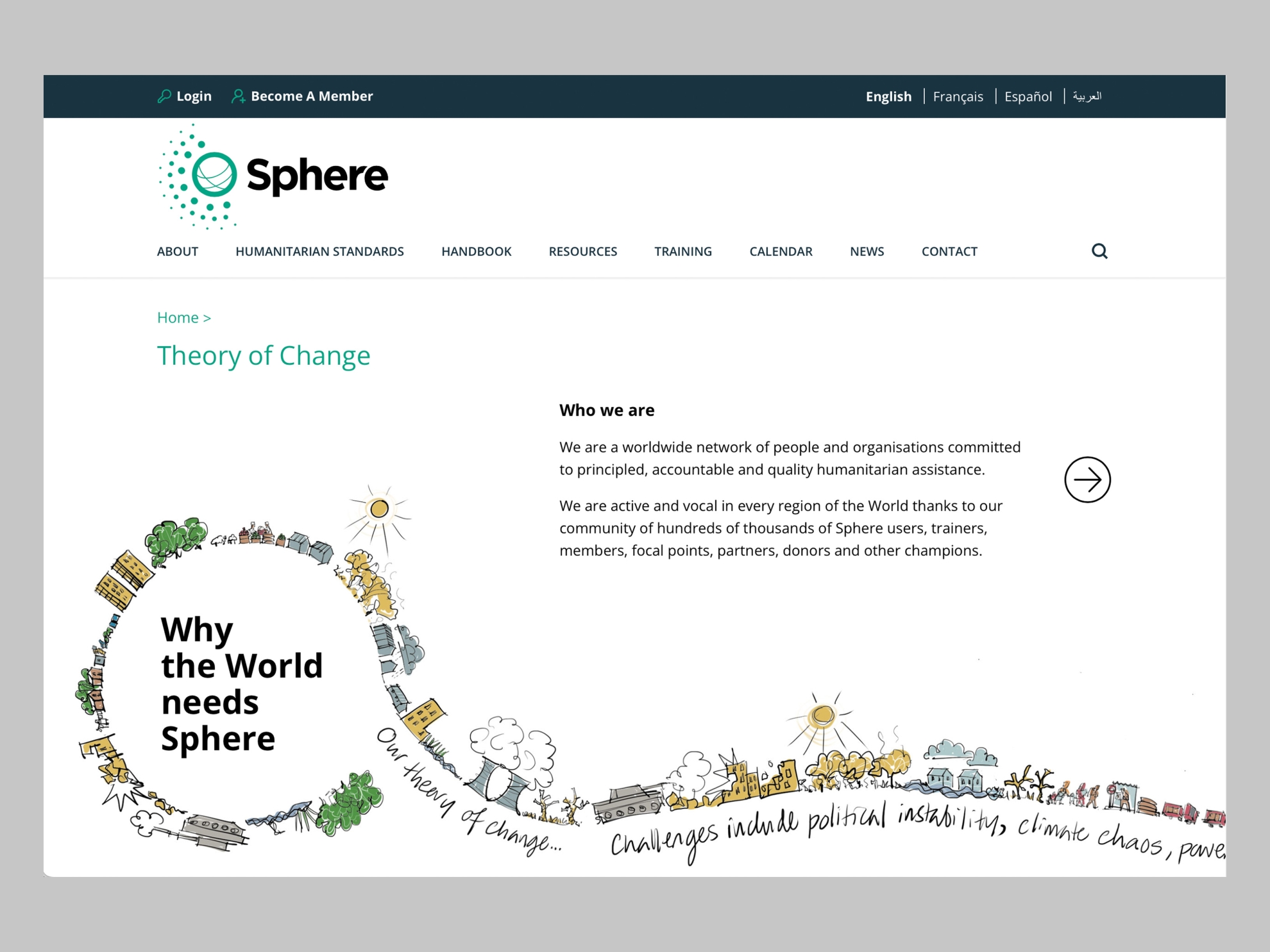
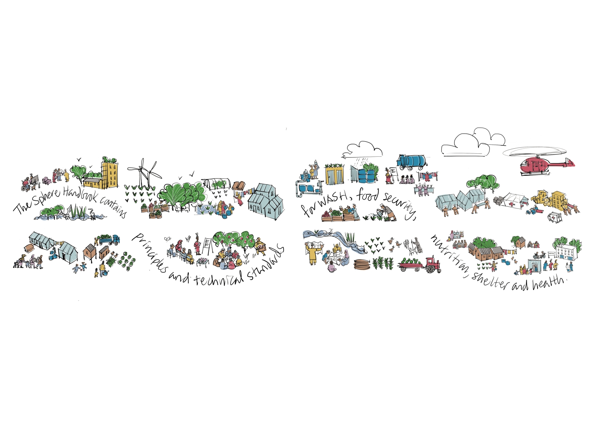
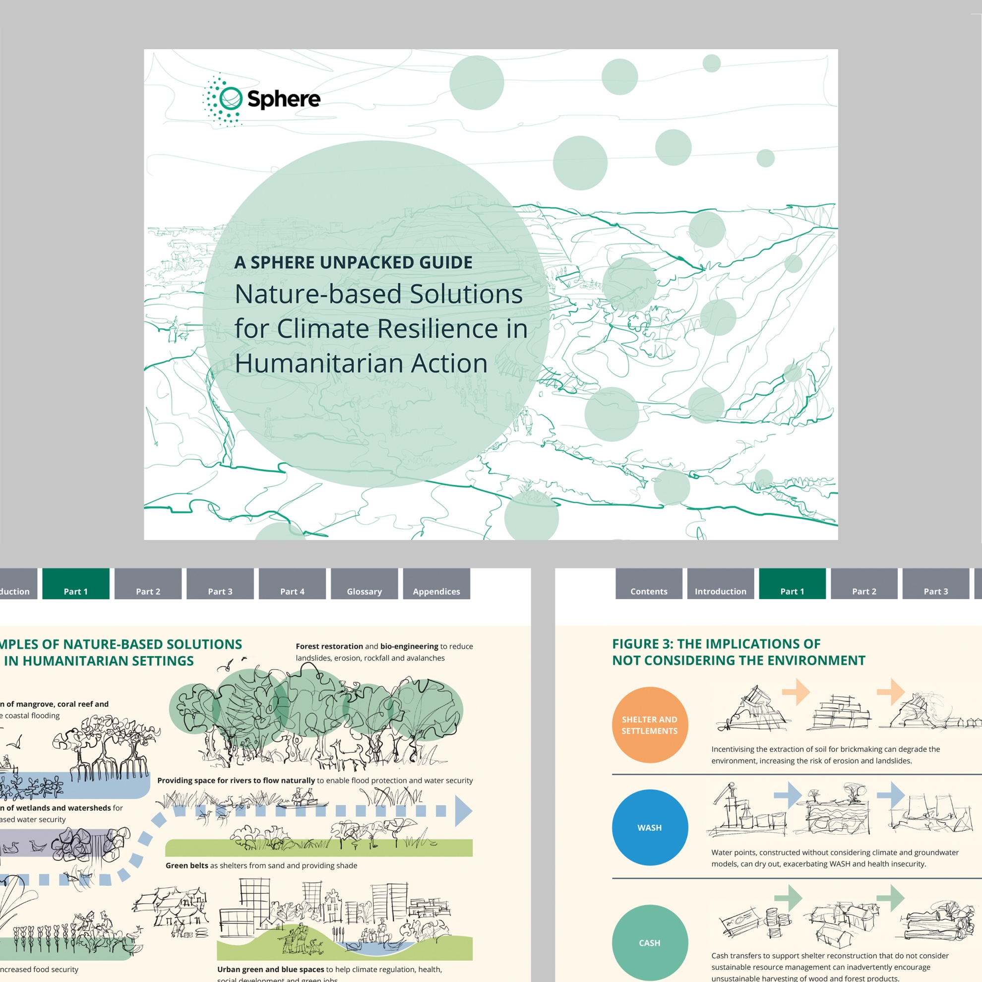
Sphere defines, promotes and applies humanitarian principles and minimum standards. Its theory of change has guided people inside the network as they write and talk about Sphere – and for the first time, the organisation has wanted to use this to explain to external audiences what it does and why.
That’s where creative input comes in.
In a process with creative collaborator Narcis Sauleda, Sphere’s head of digital and communications Tristan Hale and its head of learning and events Felicity Fallon, we have crafted a set of visual and verbal messages and materials that can be used in print for an event, online on the website and social media and in screen presentations.
For a visually connected approach that builds a coherent picture of the work of Sphere and the Humanitarian Standards Partnership, we’ve built on other recent communication design work.
My work was on over-all look and feel, on print design and on illustration, on iPad for practicality across communication platforms; Narcis designed, developed and delivered the digital components of the project, including guidance on behavioural needs and text length limits.
For all the clarity and precision in a theory of change, illustrating why Sphere exists and what change looks like has been intensely human. What are the situations to include? Who are the people involved? What does a good outcome look like? Delving into these things to communicate them externally is one of the most interesting parts of creative work.
Find out more about Sphere here.


