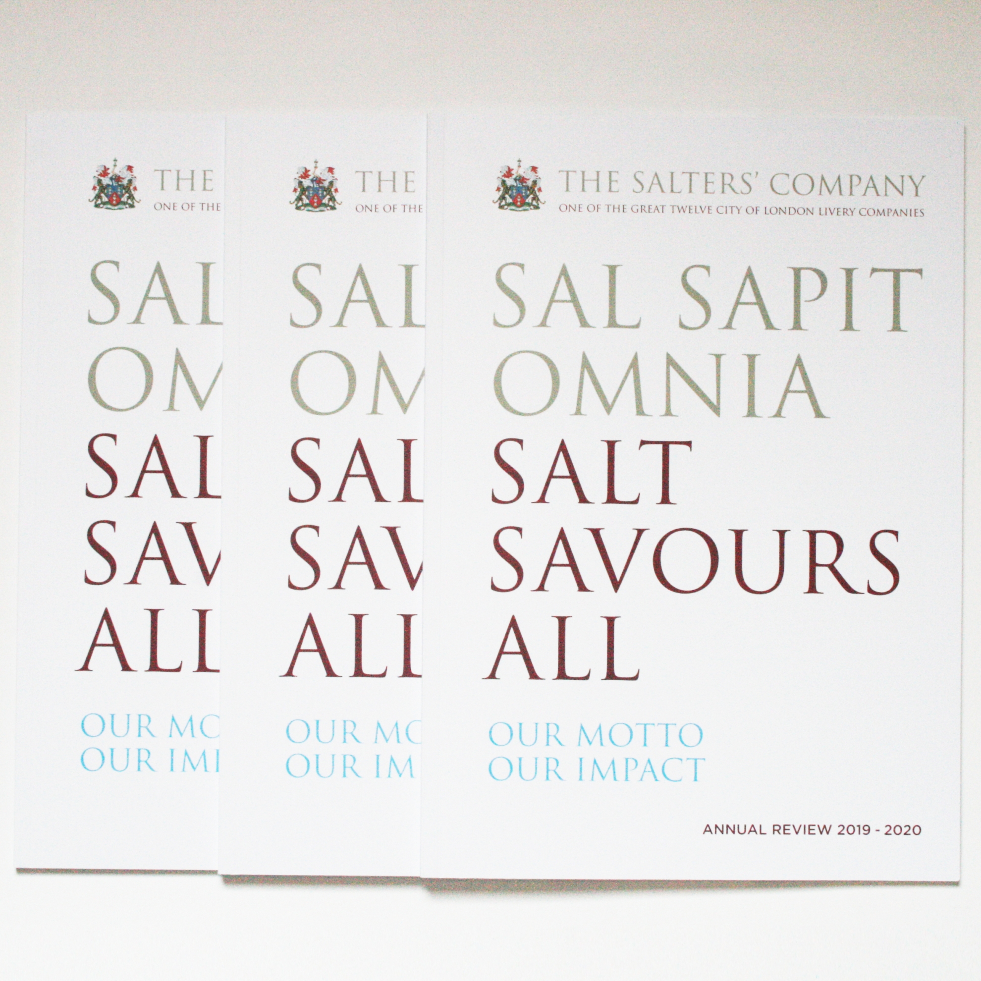

Salt savours all...
An annual review design is about so much more than layout. If I can get to the heart of what an organisation is, what it does, and what it wants design to achieve, there are all sorts of things that I can do to help.
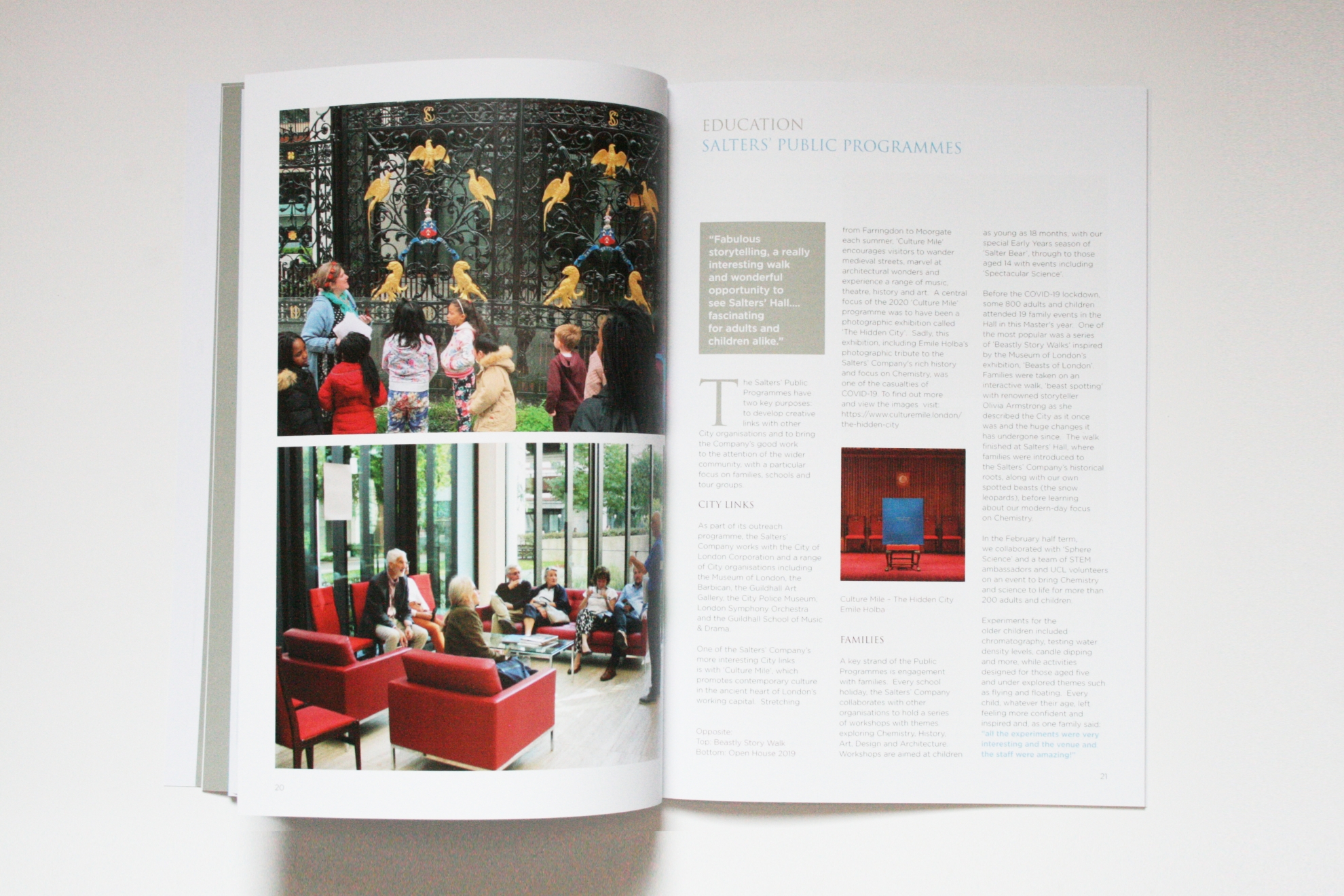
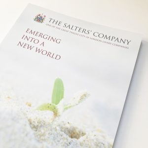
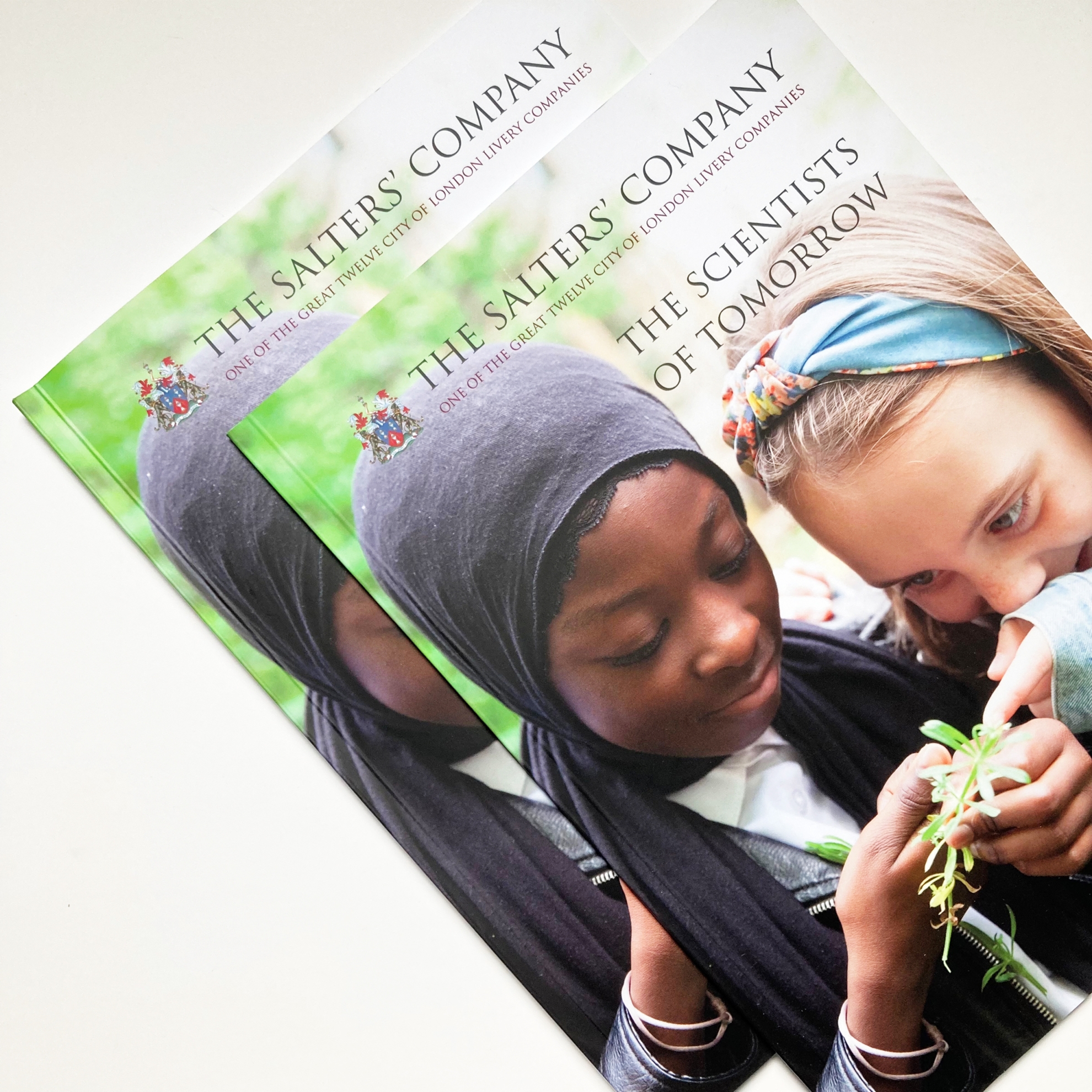
City Livery Company The Worshipful Company of Salters has tradition, charitable work and public programmes – and the clean modernity of the Salters’ Institute of Industrial Chemistry, whose focus is education and partnerships. It has historic portraits, an archive – and a brutalist building. And at the heart of the brief was a need to differentiate the annual review from the Salters’ Company’s internal magazine Salt Talk to enable the annual review to communicate as effectively externally as internally, functioning as a ‘what we do’ piece as well as a review of the year.
The idea for the words-orientated approach came from the story of salt and the sayings around its uses. The Company and Institute’s colours and fonts were brought together, enabling the Annual Review to sit well with both identities and for readers, to show how tradition and modernity are brought together.
But it didn’t stop there. An extra-matt surface paper was chosen as a nod to the clean environment of a laboratory – and the material and the biodegradable laminate used in production by WKG Print were credited on the cover.
Almost all of this project took place virtually, starting in lockdown, but lively and enjoyable Zoom discussions set up an informative and productive working partnership from the start.
The Annual Review is available online and in print.


