Kusuma Trust annual review
For my eighth annual review for Kusuma Trust, we’ve used last year’s design framework for consistency.
But that doesn’t mean simply dropping content into a template.
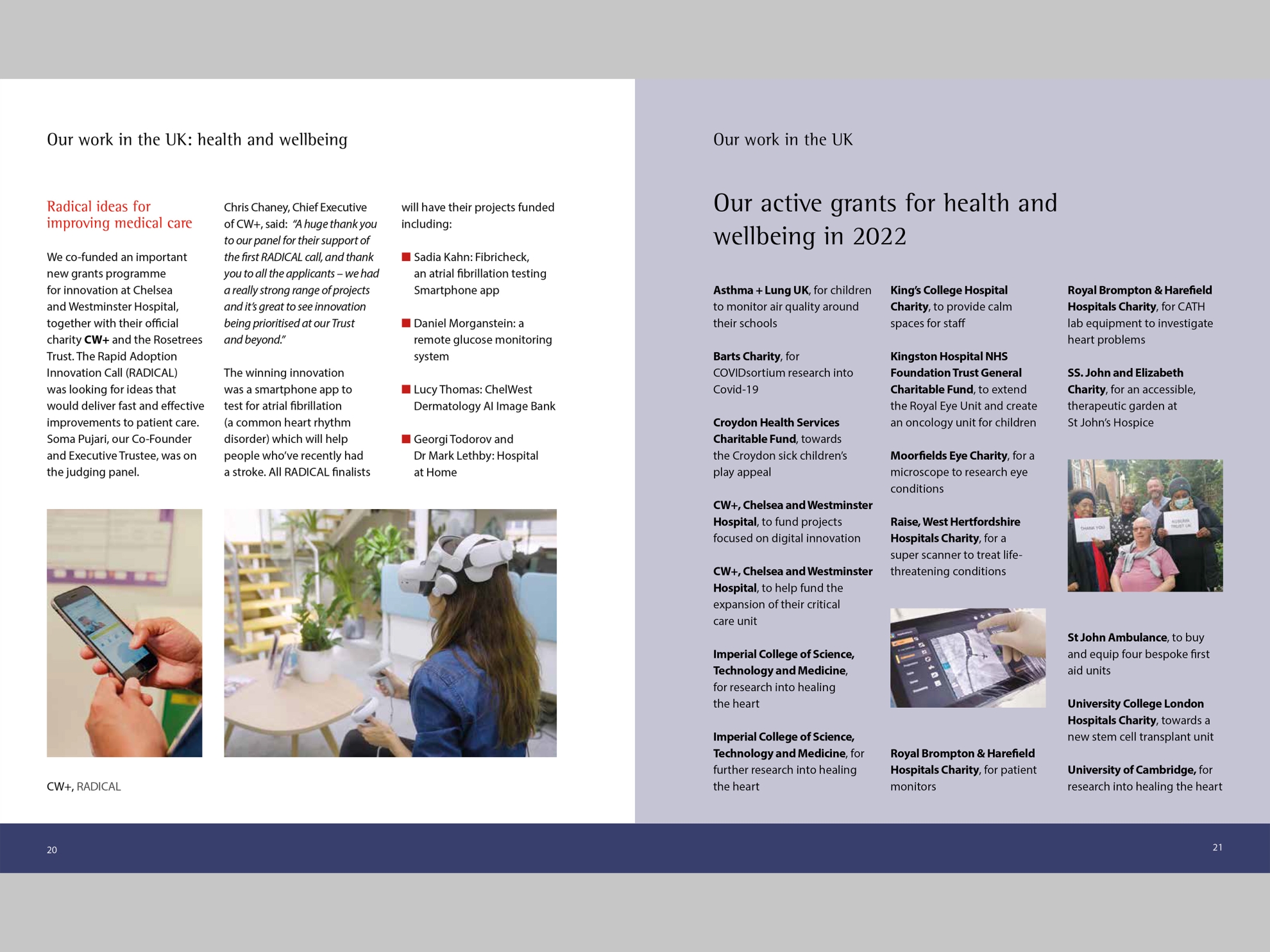
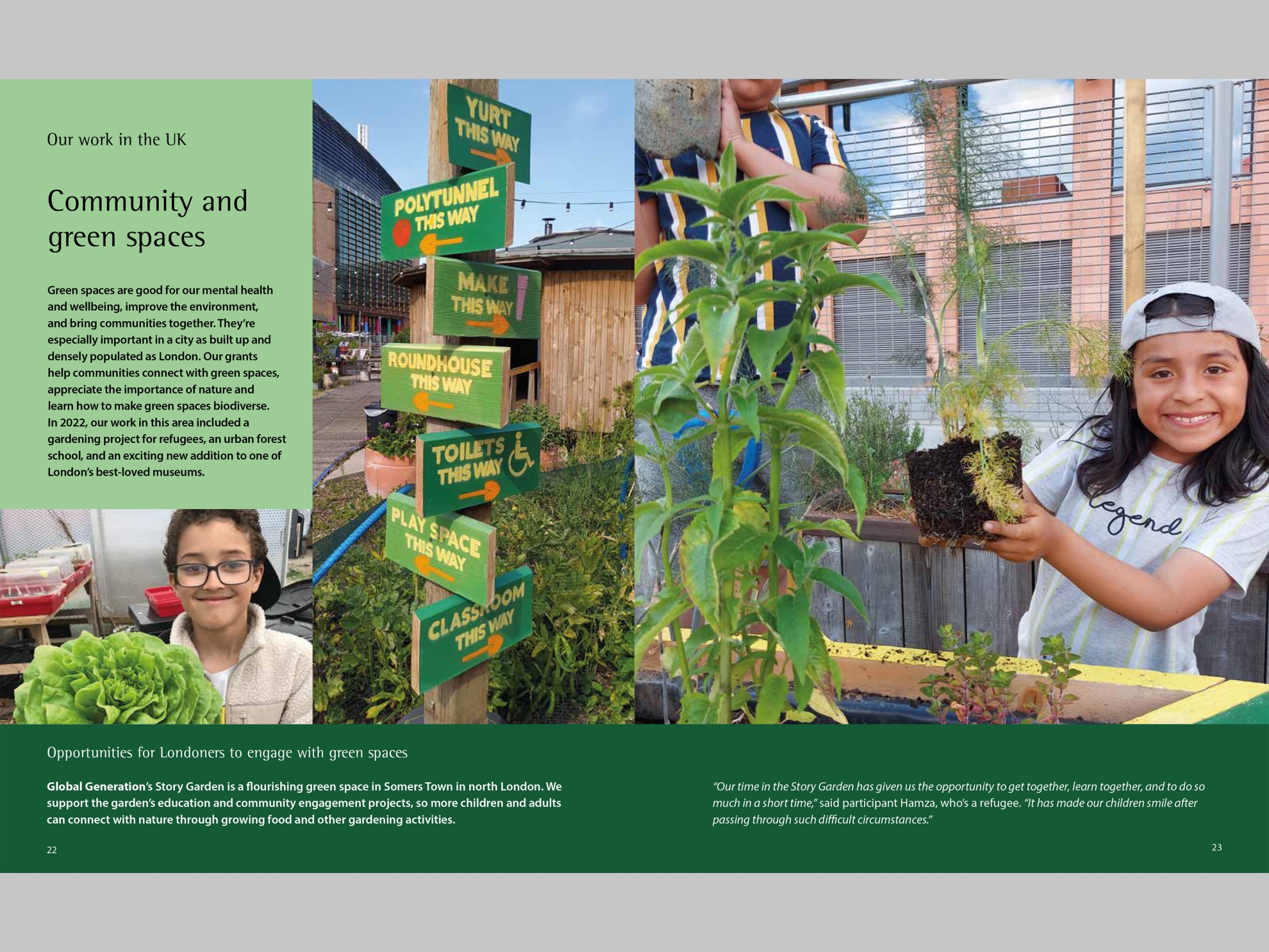
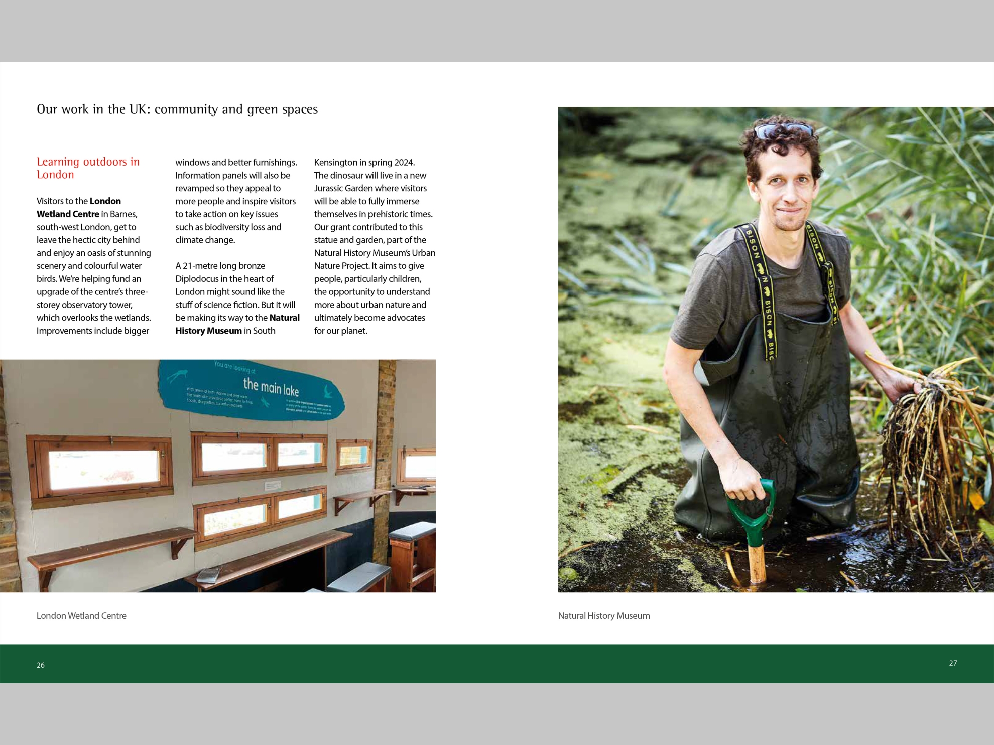
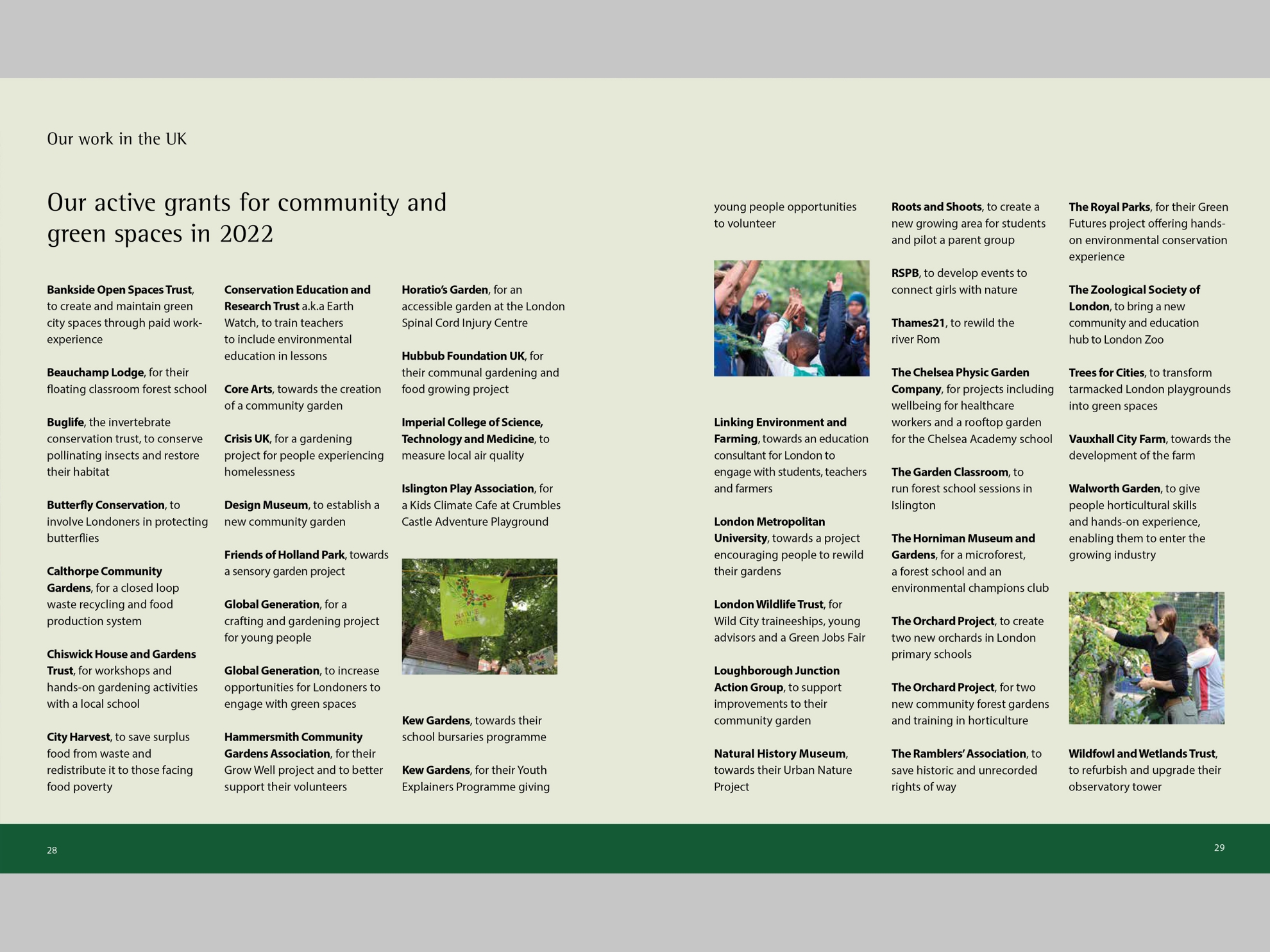
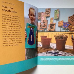
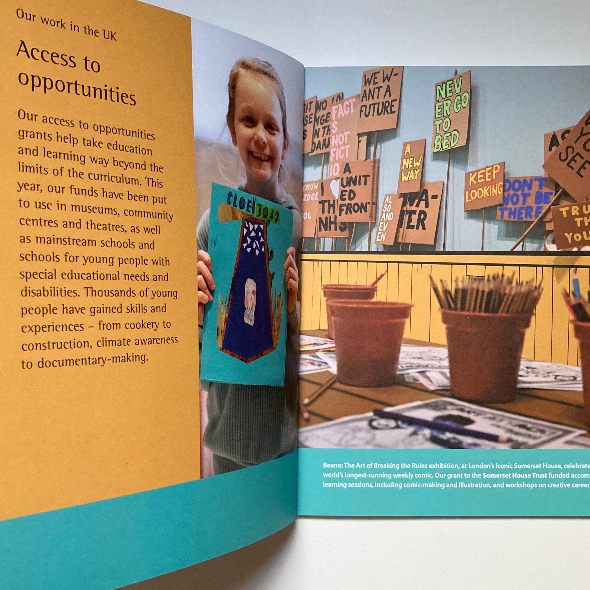
Kusuma Trust is a family-led trust making philanthropic investments in causes, organisations and people that are making a positive difference to society. Each year, there are fresh stories to tell about places, people, challenges and opportunities. Each section of the annual review starts with a picture story. There is collaborative work to do, picking out the best pictures and shortlisting them for stories, then turning the chosen stories into compelling visual spreads.
There is differentiation to achieve, to signal to readers who know Kusuma Trust that there is new information to read.
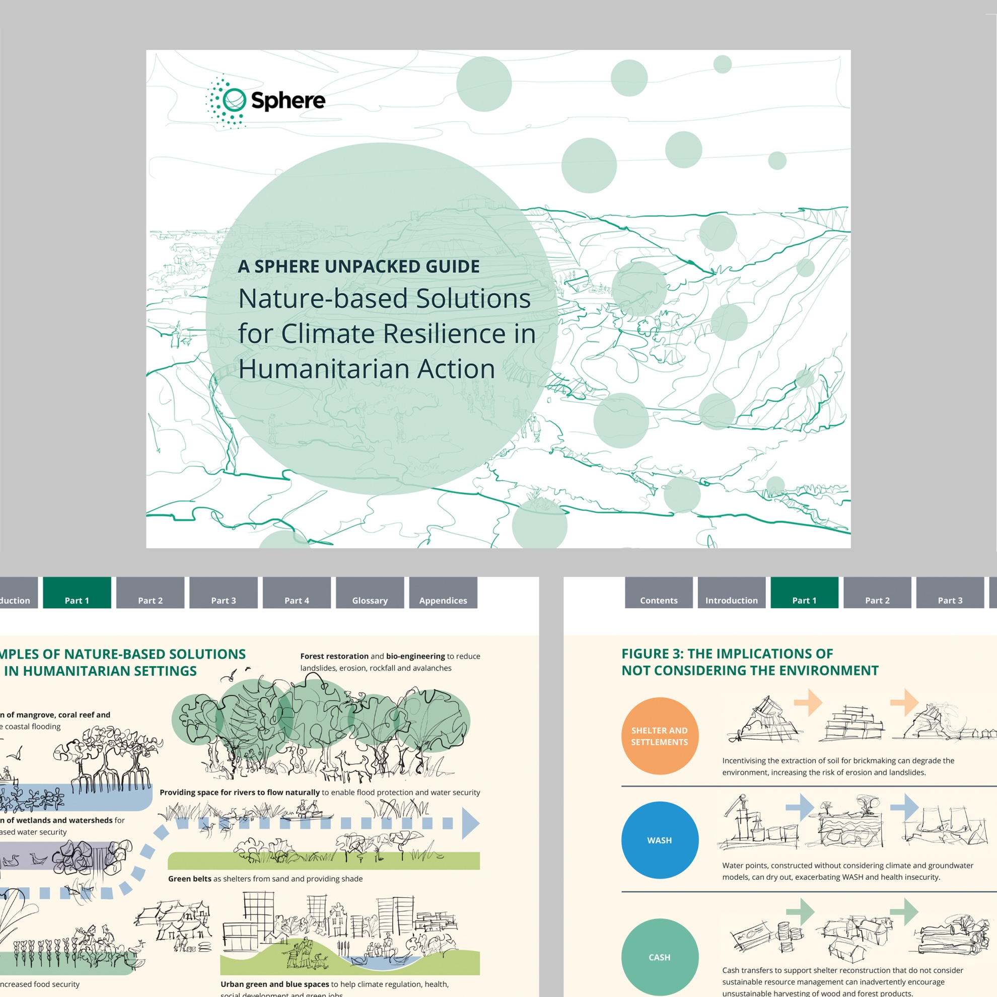
And there are the countless balancing acts and micro-decisions that go into a layout – between text and pictures; between long read and ‘skim’ read; across the publication as a whole, spreads, pages and the fine detailing of individual lines of text.
It’s content I’m proud to craft.
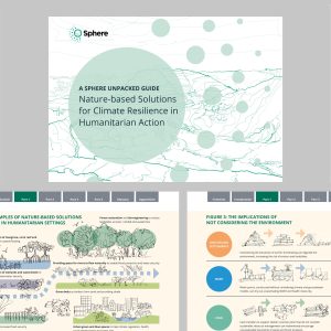
The annual review is available online and as a small print run.


