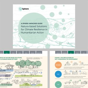
Making strategy visual…
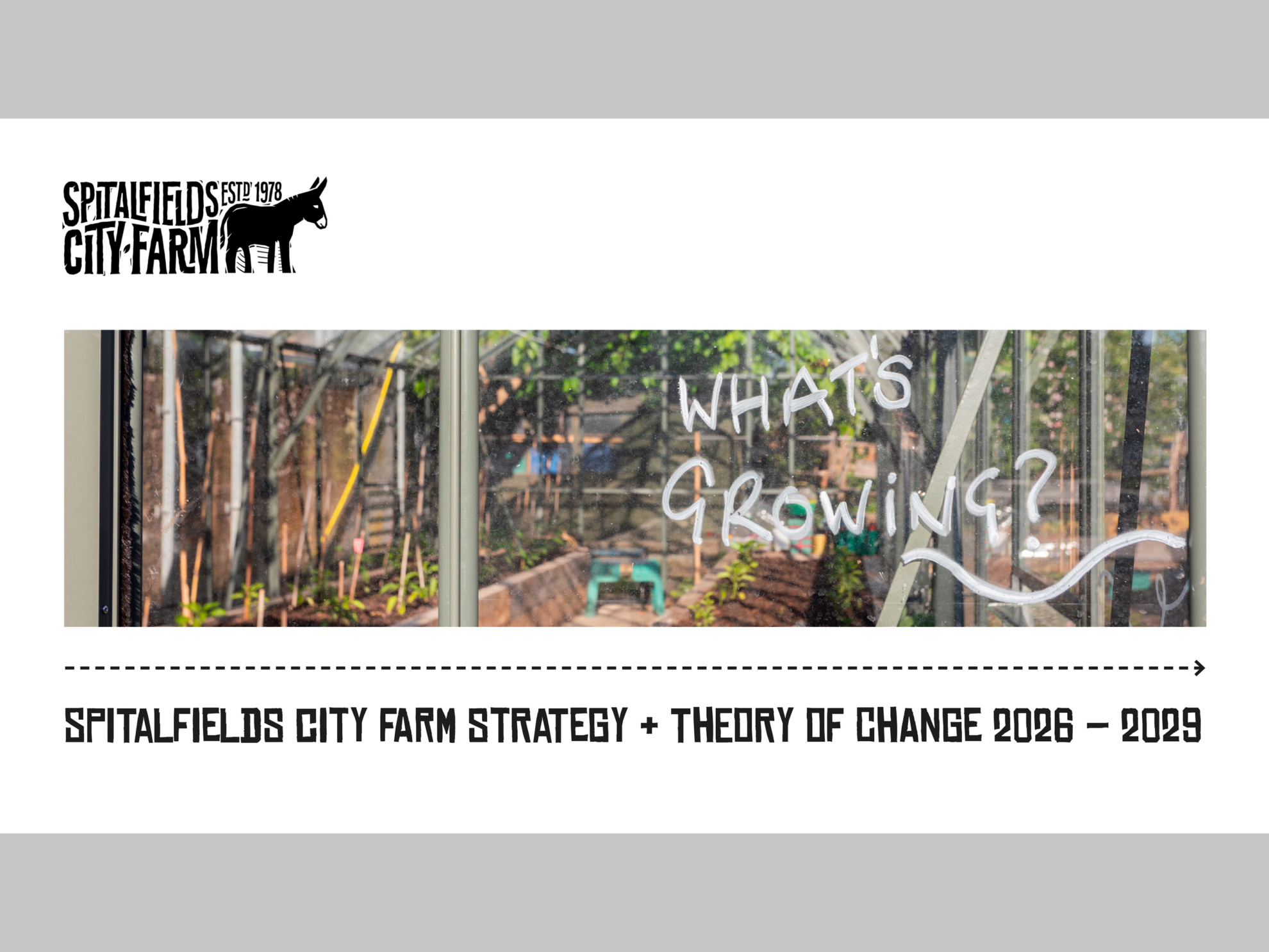
This was a brief for a PowerPoint presentation. But I knew that unless it needed to be editable, I could make Spitalfields City Farm’s strategy and theory of change livelier and more readable as a document if I designed it another way. So I asked.
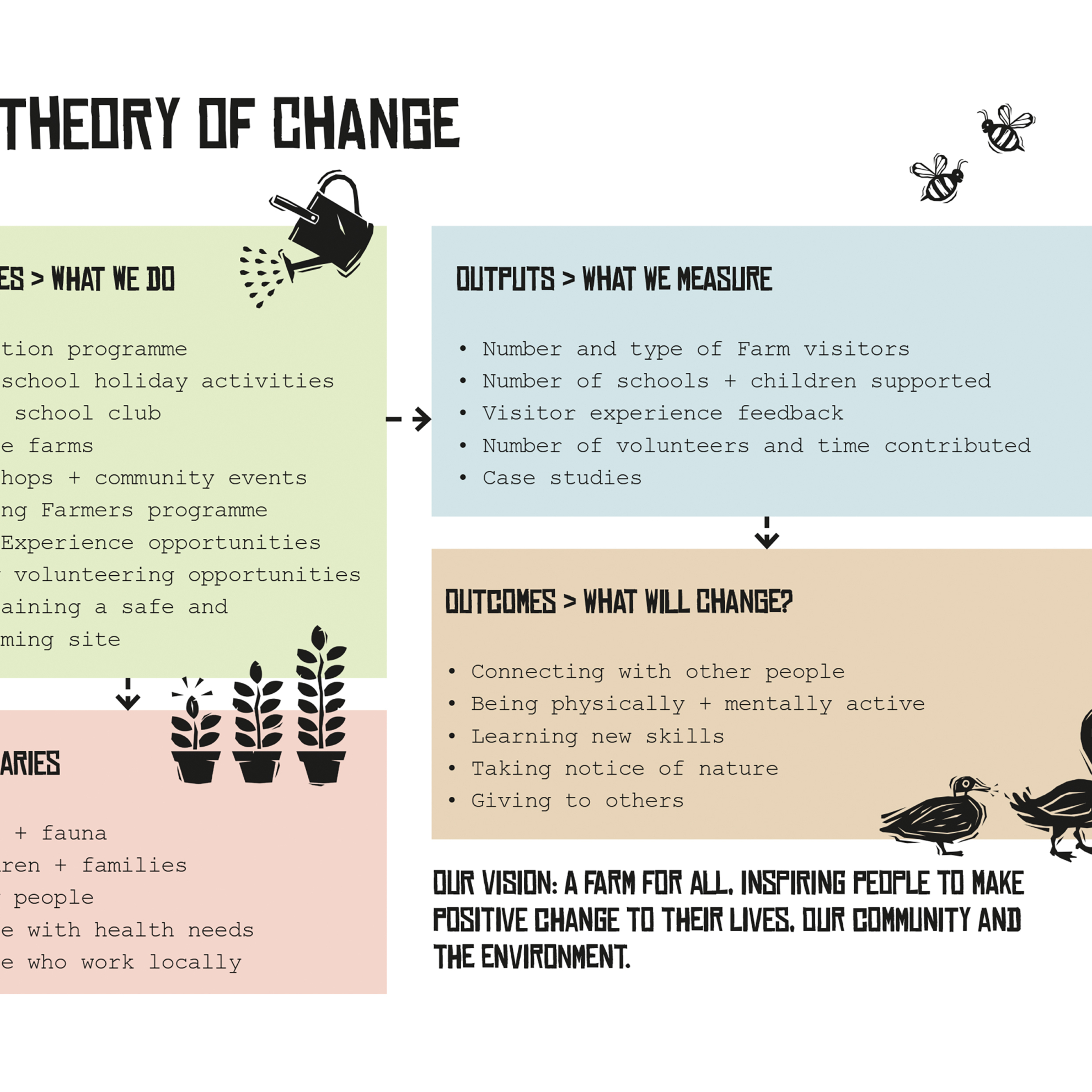
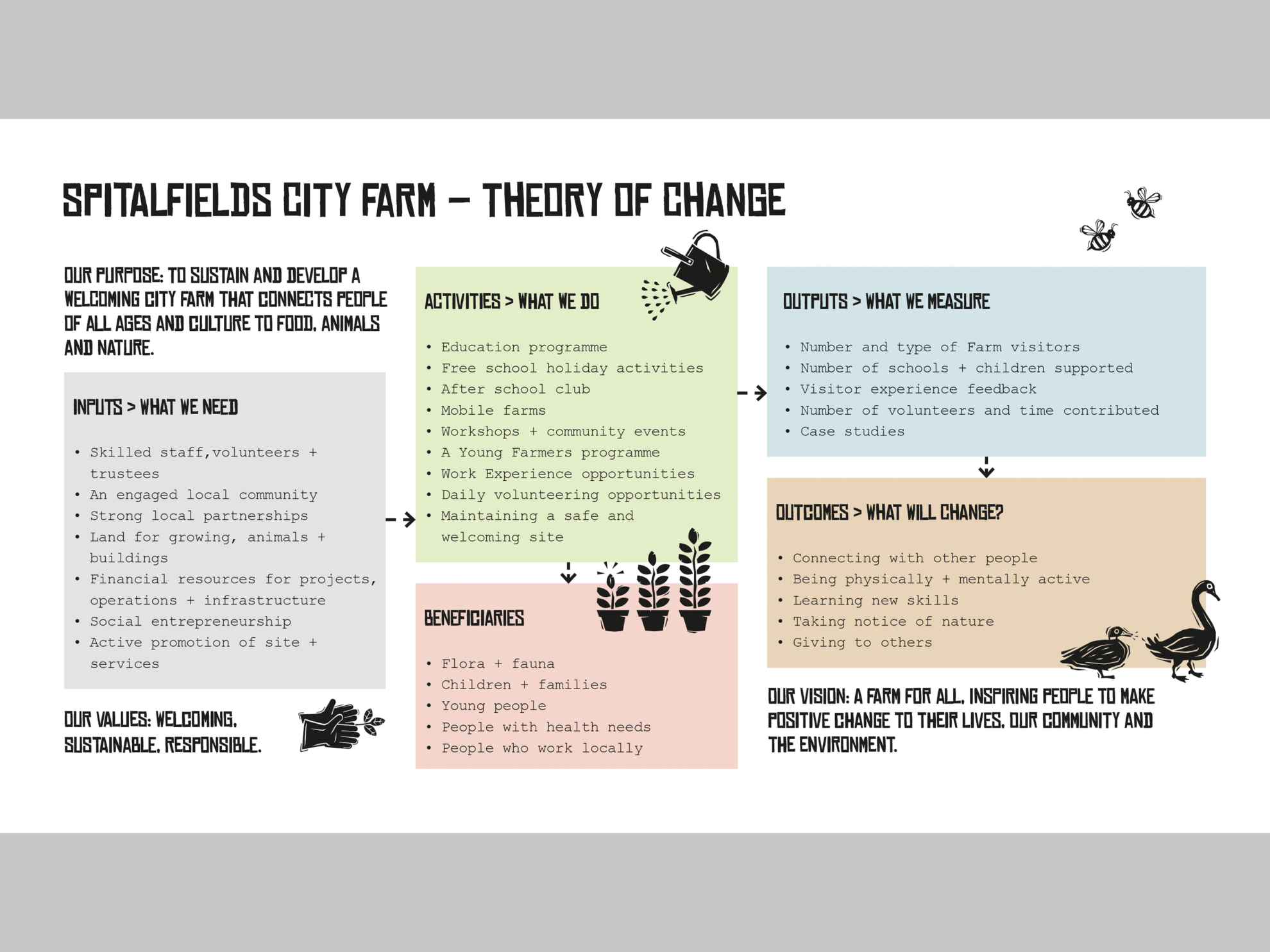
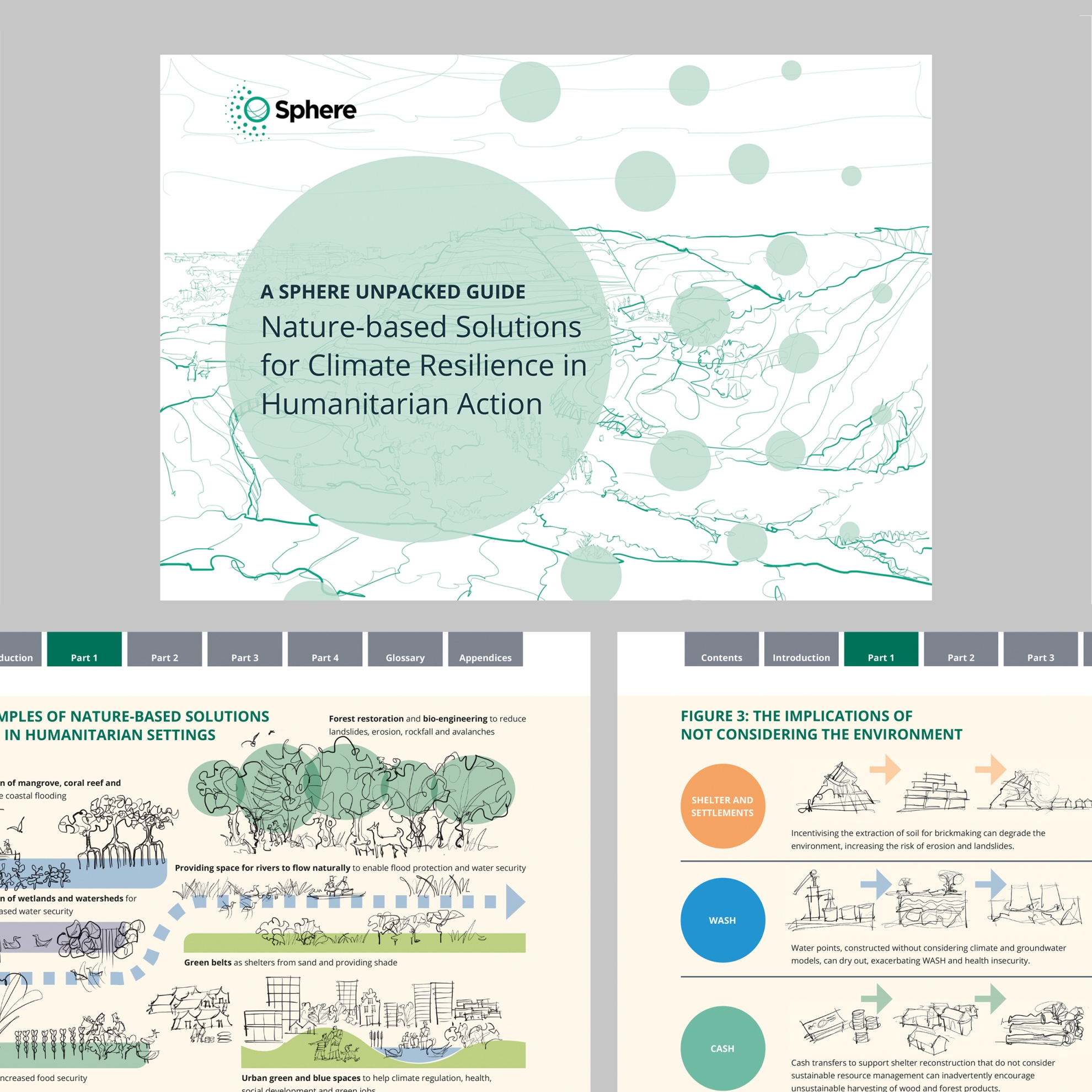
That suggests that the rest was plain sailing – but such documents are necessarily packed with information. The design challenge is to make it look as simple as possible while saying as much as possible. So design included suggested edits.
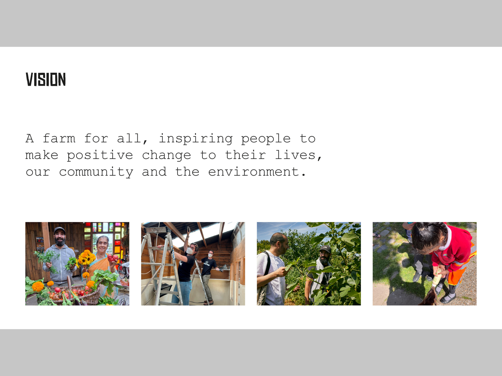
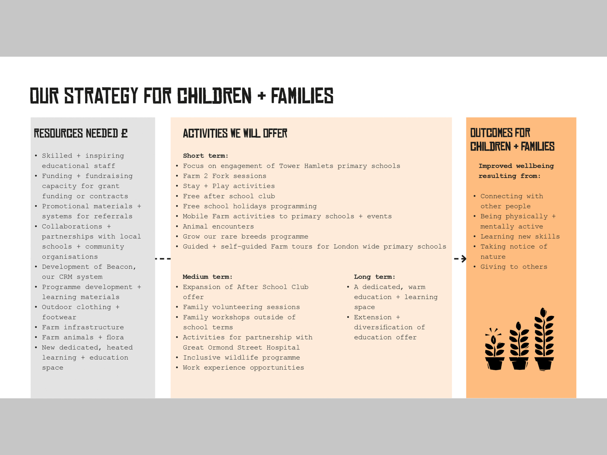
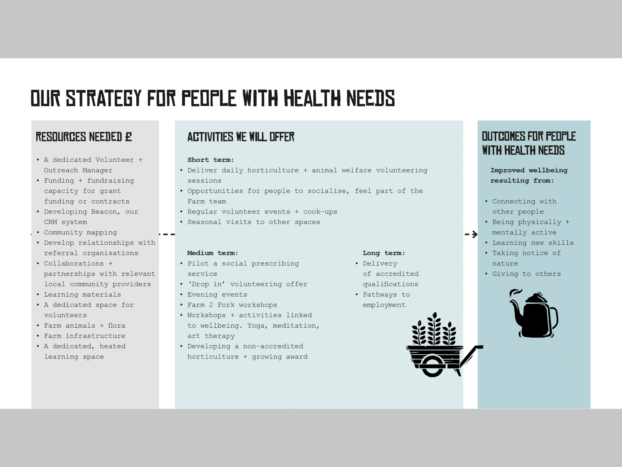
The Farm has a rich stock of brand illustrations which work well for graphics, lift the content and help differentiate topics. I’ve also used colour to help readers find their way around without overloading the Farm’s primarily black and white brand.
The result is intended to be communicative for an array of audiences and the PDF has alt tags, bookmarks and an adjusted reading order for accessibility.
All of this has been a pleasure to do for a city farm that works hard to serve its communities.
Read more about the Farm on its website.


