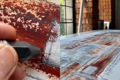
It’s easy to miss. London Bridge writes its name where passing boats might see it. But when I typeset Jonathan Holt’s poem London Bridge on London Bridge to enclose with our lithograph for 26 Bridges, a project by writers’ organisation 26 to raise money for a UCLH specialist clinical nurse, I wanted to respect its square letterforms in my choice of typeface.
It’s difficult matching letter cutting. There’s quirk in it. There’s the hand in it. These letters have thicks, thins and a little serif kick.
My first thought was Melior but it had more curve and more serif than I wanted. So I settled on Eurostile – emphatically sans serif and it predated the start of construction of the bridge by a few years but it had the squareness of its letters and it was more or less contemporary.
Eurostile was, my Encyclopaedia of Typefaces tells me, designed in 1962 by Aldo Novarese, itself complementing another typeface, Microgramma, which was titling so in capitals only. Its letters have “some pen-drawn characteristics”.
Why go to this trouble? Well, because I care – but more than that, because I’m interested. This wonderful collaboration has presented many opportunities to delve into the stories in this apparently workaday bridge.
Read more about the project in its case study, on the Bloomsbury Festival website and make a bid on the auction site, which will be live until the online auction on the evening of 16 October.