The Corporate Digital Communications Index...
Working with clients on communications over time is rarely more of the same. Contexts change. Audiences change. The practicalities of launch and distribution change.
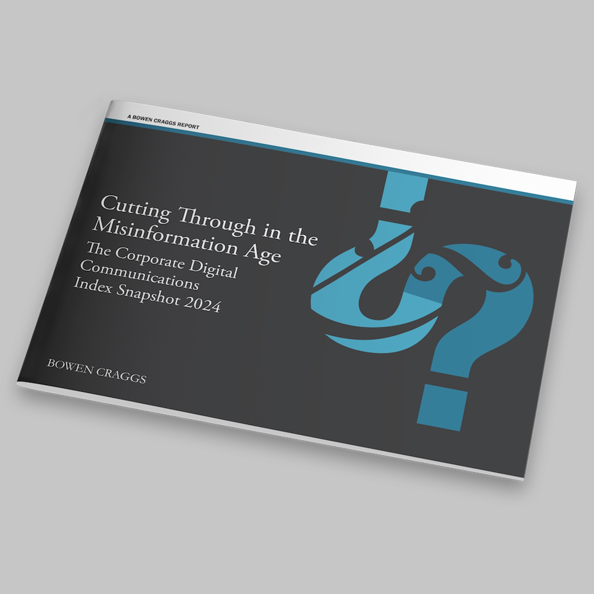
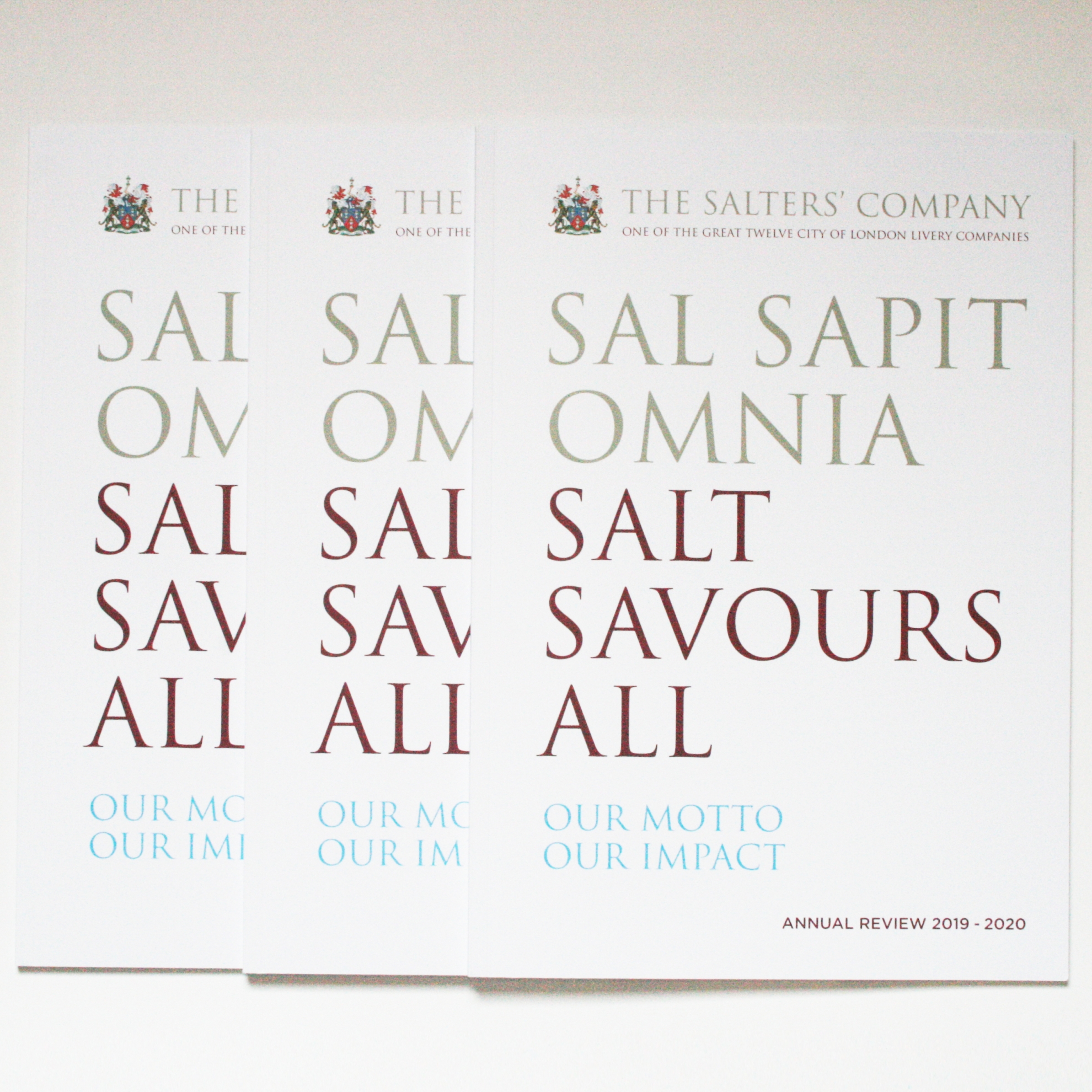
This year, what was the Bowen Craggs Index has a new name: The Corporate Digital Communications Index. It has a broader audience, including prospects. And the PDF-only snapshot of the past four years has a print edition, with display, for its event in New York. So this year’s design has started with a shift in format, some production research and bringing in some of the bold design approach that we’ve used for a recent research report.
But work has started before design of the publication itself. The Bowen Craggs colour palette had been adjusted for accessibility online and in PDF. That had given us some surprises at the proofing stage of the first publication using the new palette in print. So to inform design and save production time, there’s been a proofing exercise of all of the brand colours.
For the PDF edition, in line with online communications, there’s more detail in the accessibility setup, then, once approved, that’s been adapted for readability in print.
And that’s not all. It never is – and that’s how it should be. This work will feed in to the next project, creatively and operationally.
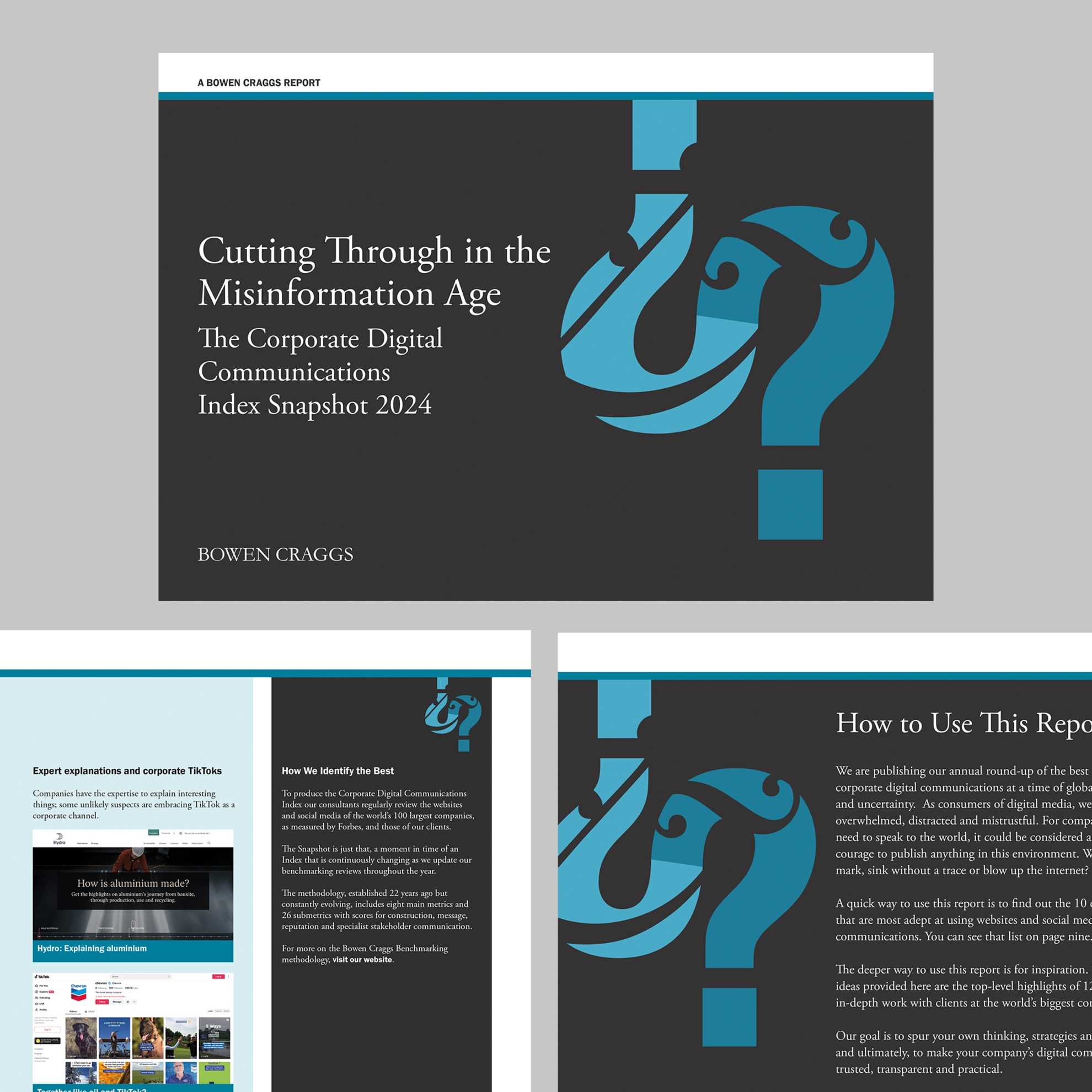
Print mockup: Bowen Craggs / Jon Wallace


