


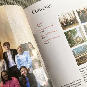
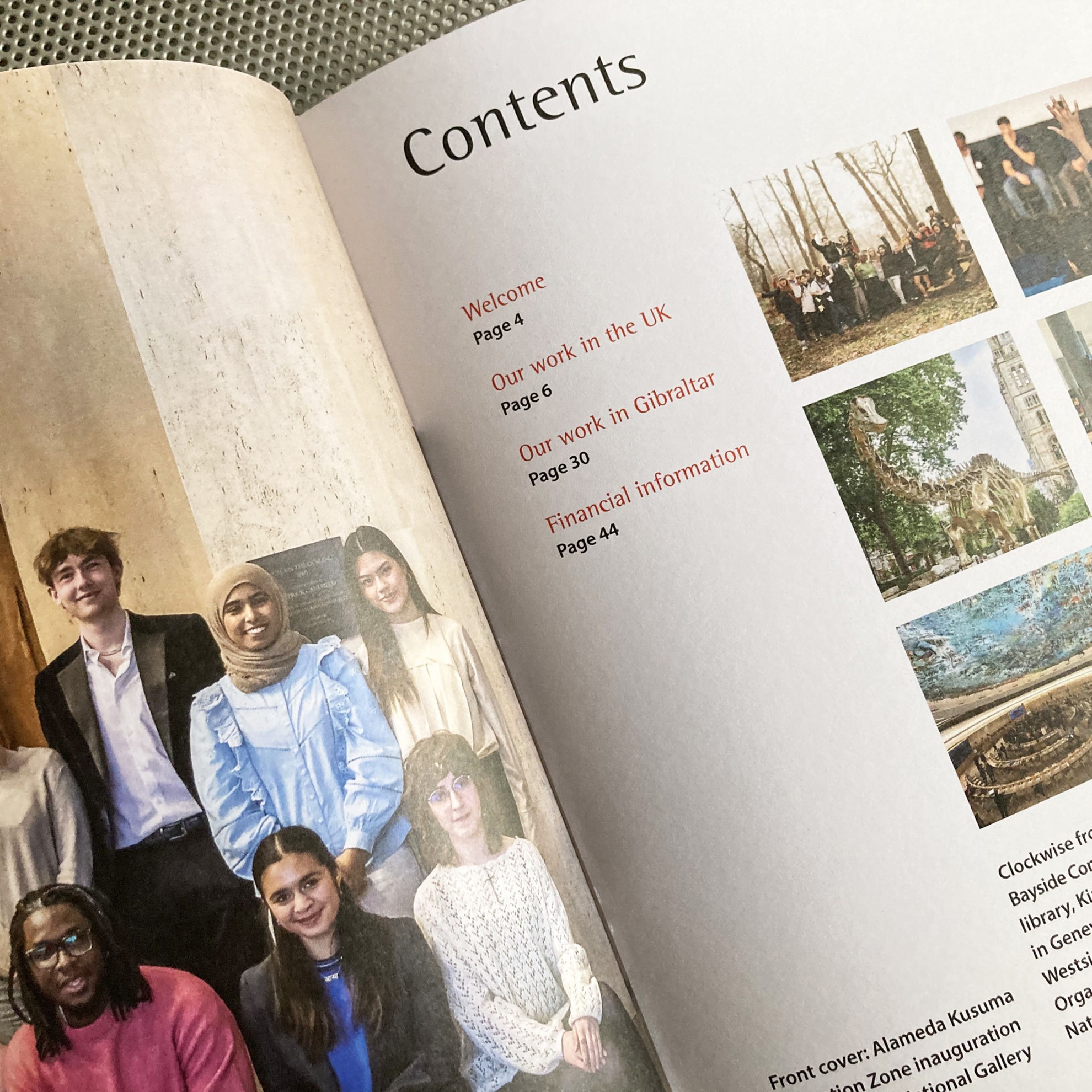
An actual launch date
This project involved the two coolest bits of research I’ve ever done: a visit to the European Astronaut Centre in Germany to hear from people who train astronauts and a trip to the Long Arm Centrifuge in Farnborough.
The central branding job was to interest schools and students in getting active via space science, and involved in space science via sport. So those research trips made all the difference, in understanding the physical challenges of zero gravity and in taking in the visual language of space missions.
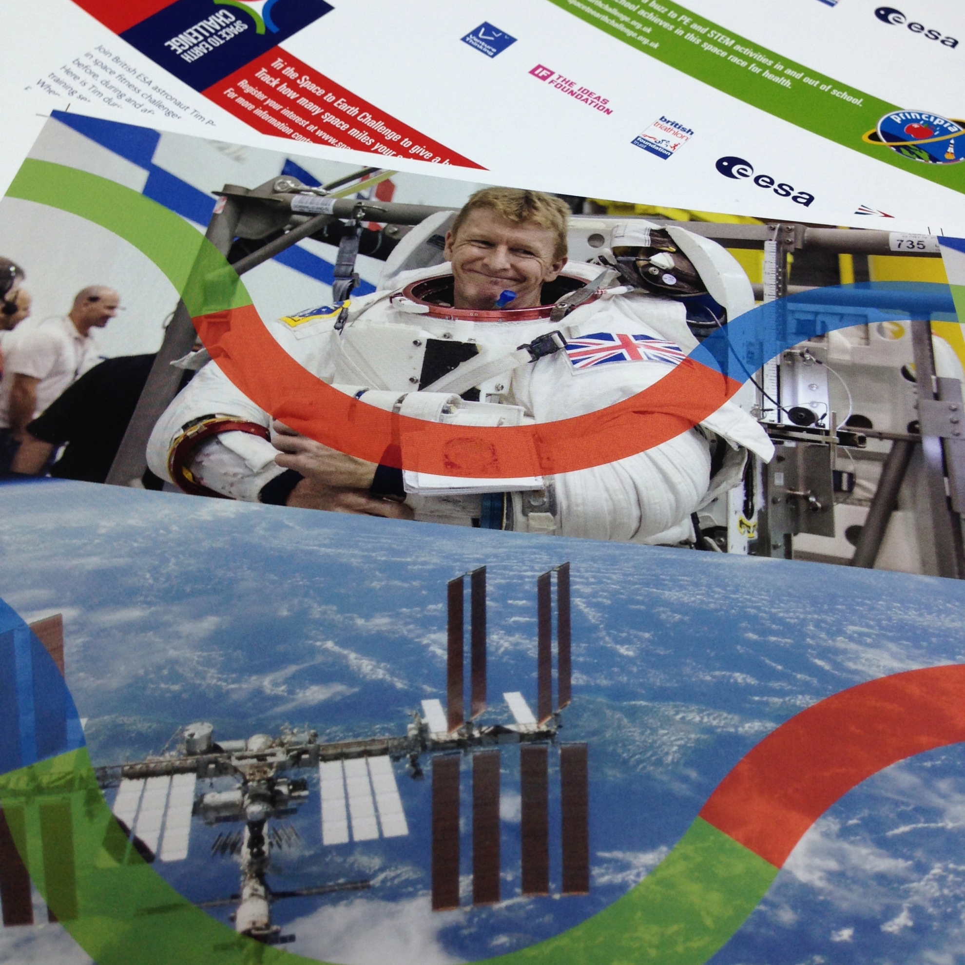
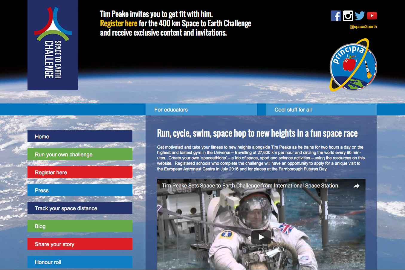
Space to Earth Challenge is a triathlon-based, STEM (science, technology, engineering and maths) -linked programme of activities for school students from late primary to early secondary age. It followed British ESA (European Space Agency) astronaut Tim Peake as he trained before, during and after his Principia mission to the International Space Station.
Devised by Venture Thinking, Ideas Foundation and Triathlon Trust for the UK Space Agency and ESA, the programme has involved a multidisciplinary team and included events, resources and activities that schools can run themselves.
To experience what Triathlon Trust does, I volunteered at its mini tri event in the Olympic Park, which was as important in observing the work of setting up as it was in seeing first hand how accessible the event was for children of all abilities and absorbing the visual language of sport. Along with the project team, I heard from young people too – at an initial ideas hack and later on, with primary school students testing an idea for a cupola postcard for event social media posts.
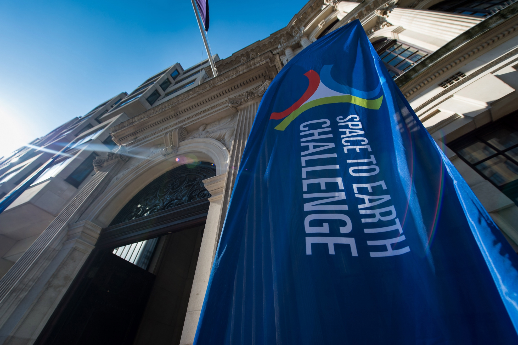
There were practical considerations too. The identity had to sit alongside an existing mission patch and multiple partner brands. The design framework had to be functional for print, online, display and document resources for information, publicity, operations work and events – initially to invite schools to register their interest, then for the programme itself. And there was, literally, a launch date…
The result was a flexible identity. At its core was a graphic combining an orbit made from three components, representing triathlon and the three phases of mission training. This could be deconstructed and rearranged to do a variety of jobs. Its colours came from the mission patch. And the visual approach was clean and simple, to let awe-inspiring mission pictures tell their own stories.
The programme has exceeded expectations, going on to become the Space to Earth View Challenge.
Web build by ee-web
Crew polo shirt graphics by CreativeHex
Portrait and banner photographs by Michael Cockerham

