When I design a visual identity, I consider with clients all of the jobs required of it that we know about, as many as we can anticipate and I design in the flexibility to adapt with change.
Then there are the challenges that we tackle as we go.
Accessibility work at Bowen Craggs on its website has been integrated into the design of PDF communications and updated brand guidelines.
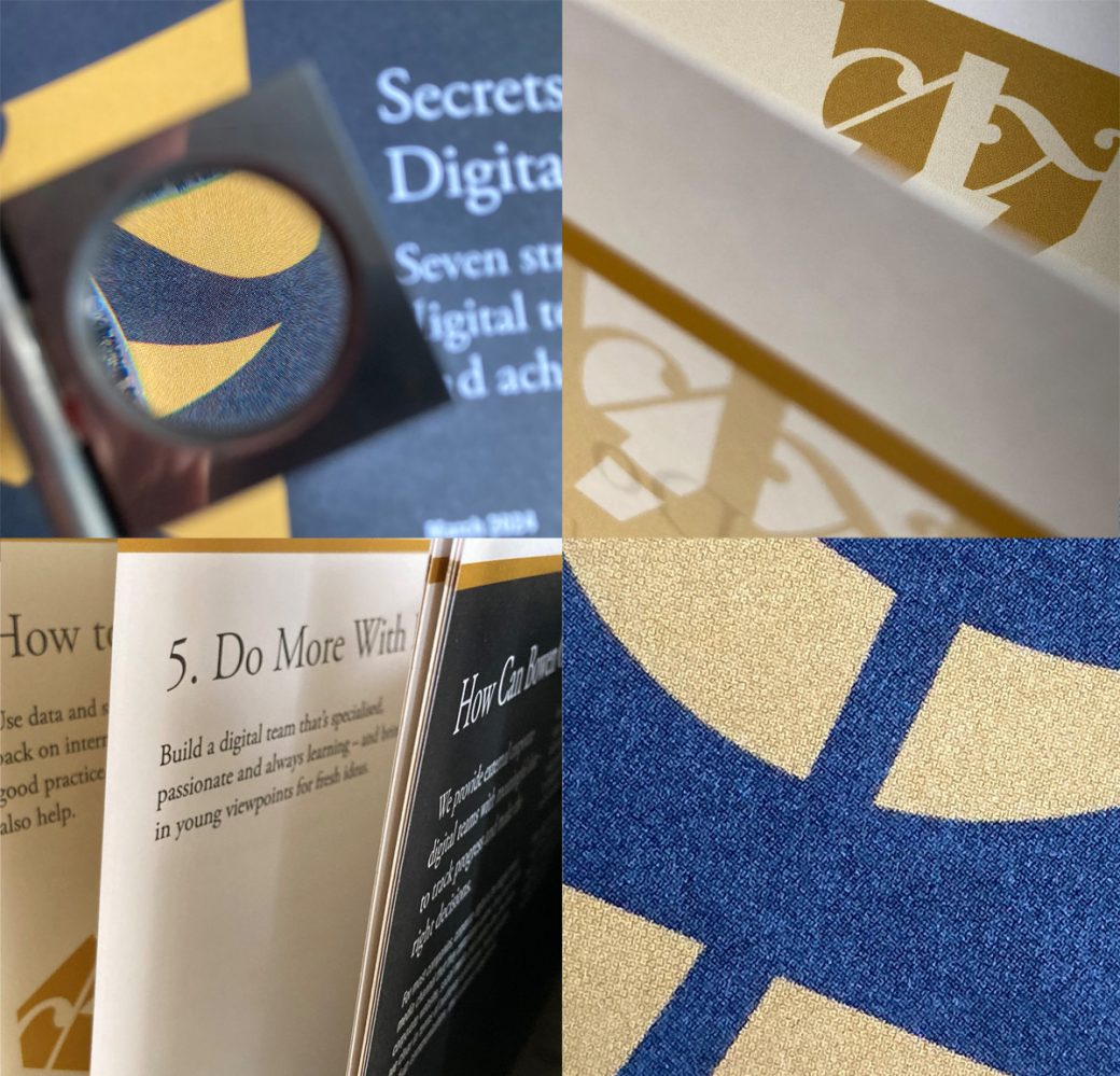
A rare piece of printed material, for a conference, has been a test of how entirely screen-based colours behave on paper.
That’s where it’s handy to have breadth of experience, of media and of designing for events. I know to expect differences between colours on screen and in print, that materials and processes play their part in how a colour prints and that when there’s a critical deadline, it’s good to know exactly what you’re going to get.
So I asked for printed proofs. Twice. On the face of it, that’s over-engineered. But even I was surprised at how much lighter some of our darkest accessible colours looked on paper. At proof stage, we discussed them, and we made design changes for readability.
That was time well spent and entirely consistent with the consideration at the heart of the Bowen Craggs brand.


