January has been a month of resolutions – so in this month’s Studio Snack podcast episode, we look at less. In snacks, and in design, where minimalism has made careers.
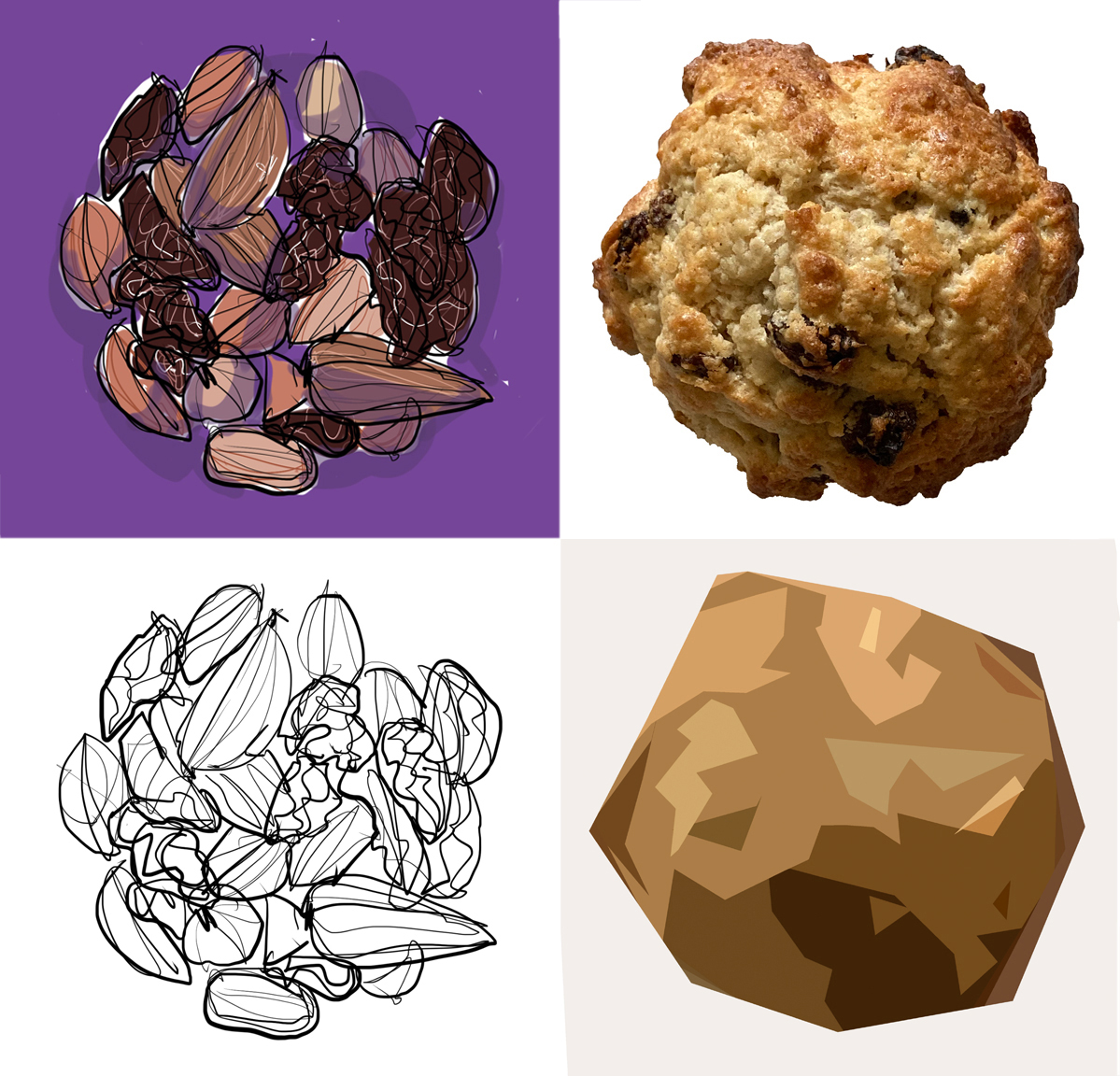
Our creative experiment has been to simplify an image of a Winter snack.
I talk about sketching some fruit and nuts and seeing what automatic alt tag generators make of them. In doing this, I've learned two things:
In my head, I was going to start with simple shapes. But I sketch rapidly in line, then add colour. So I've worked backwards, saving images as I've gone along.
And logically, more detail should be more informative – but the mid-stage and initial line drawings got me the closest descriptions. (Raisins, though, turned out to be a challenge too far...)
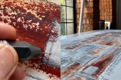
I've also photographed a rock bun and simplified it using filters (this one doesn’t make it into the episode). The more you do this, the more the rock bun becomes a rock.
Which is where I’m trained to think about whether that’s what I’m after or whether it needs to be readable as the thing it is.
Listen to the episode here.